global creative
Loading
global creative
Loading
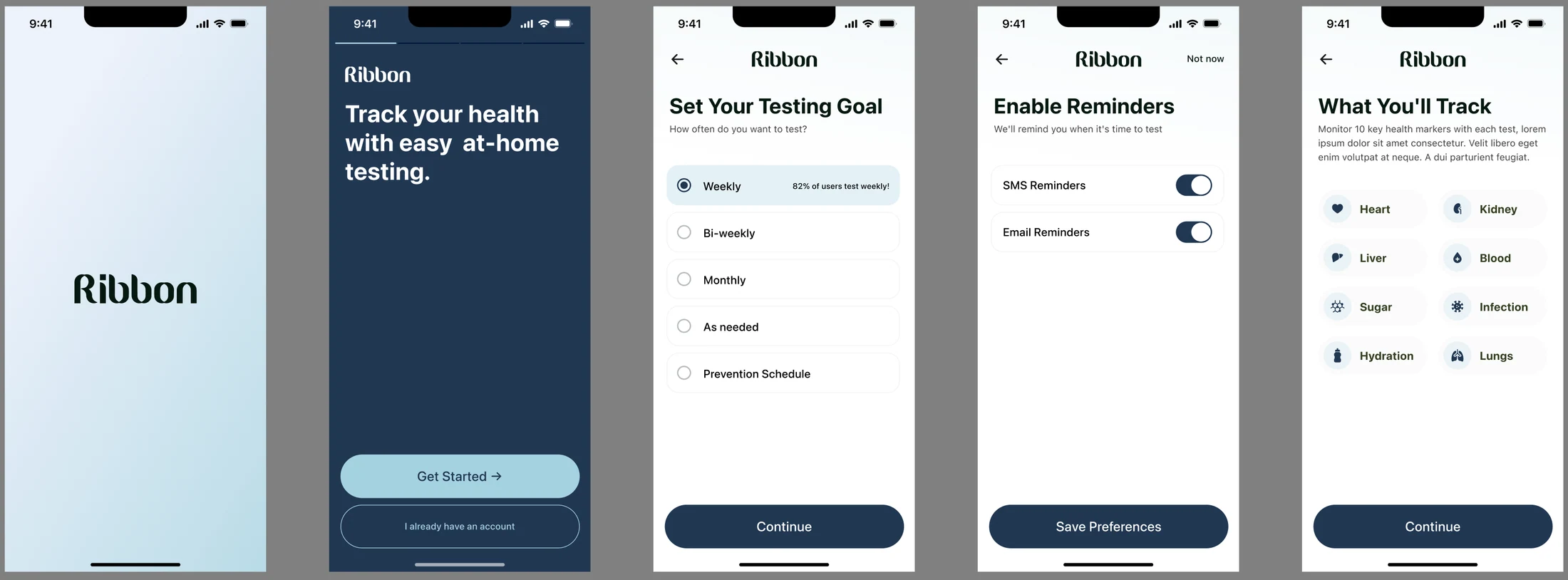
Ribbon needed to bring its healthcare offering into one coherent experience, connecting the brand people encounter with the website they explore and the product they use. The design challenge was to make health-testing information approachable while maintaining a sense of clarity and precision.
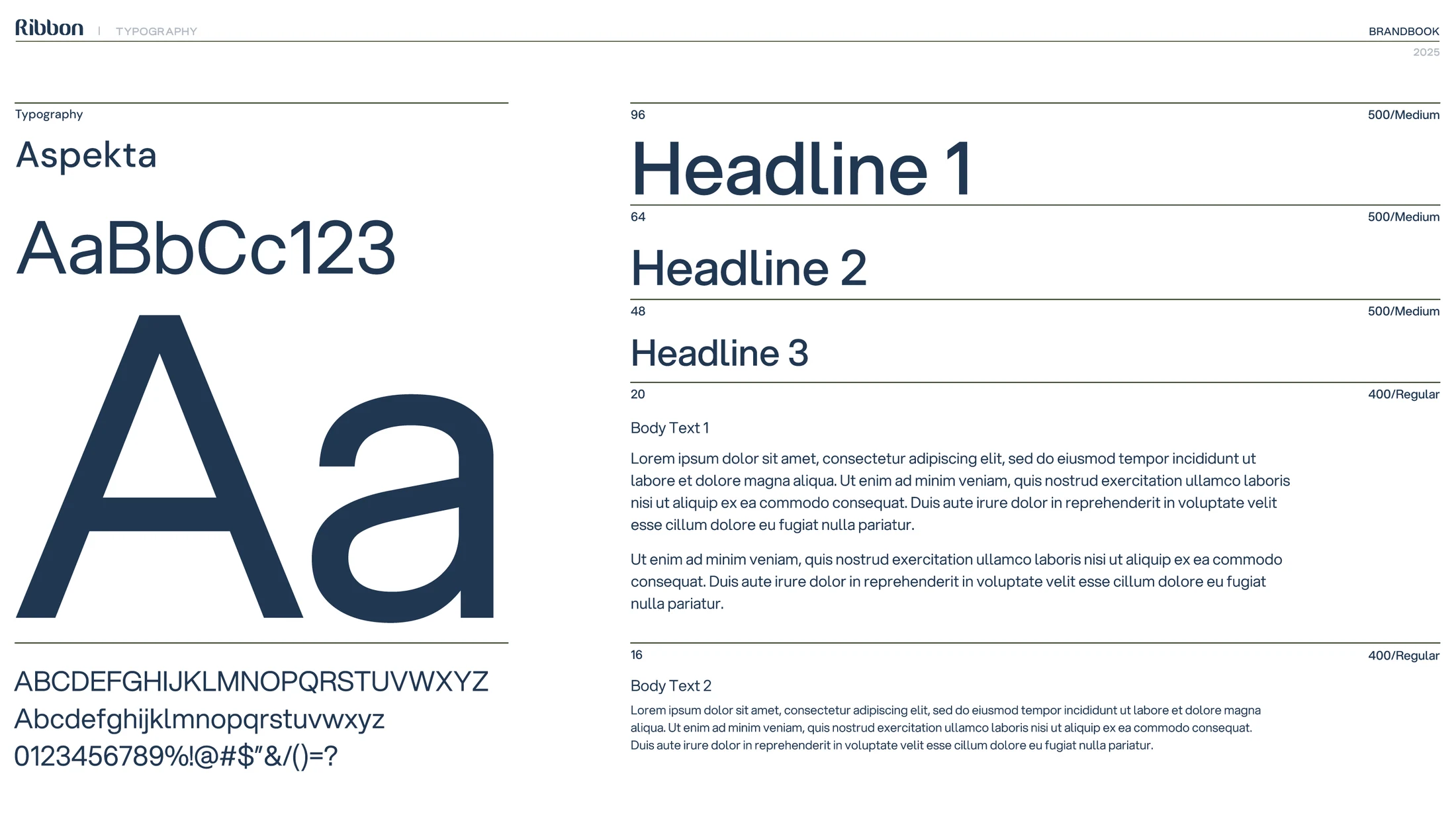
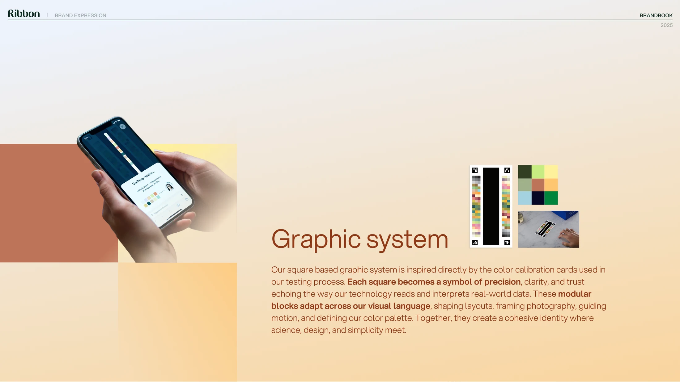
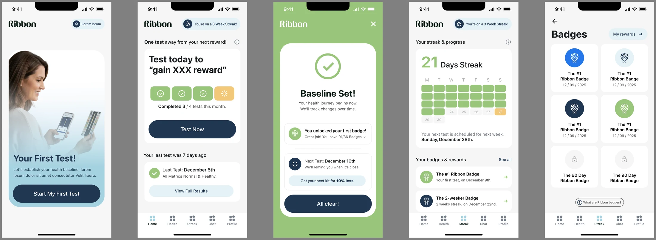
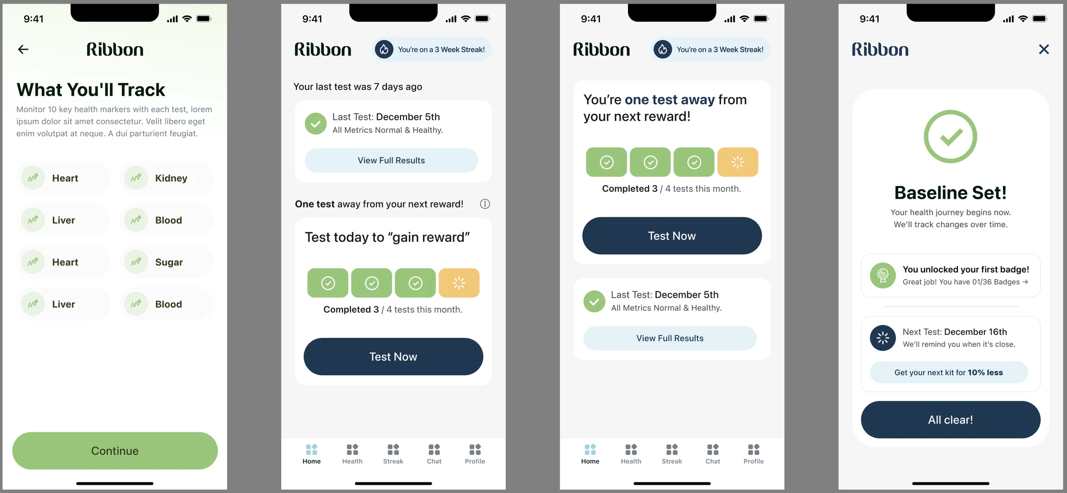
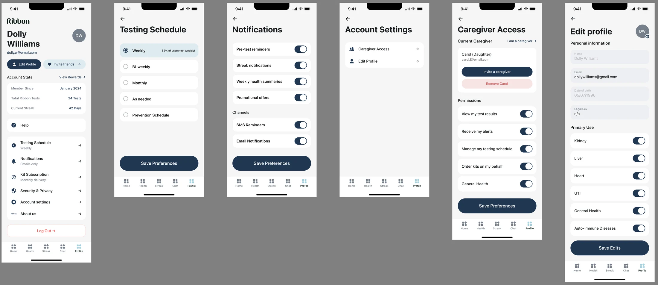
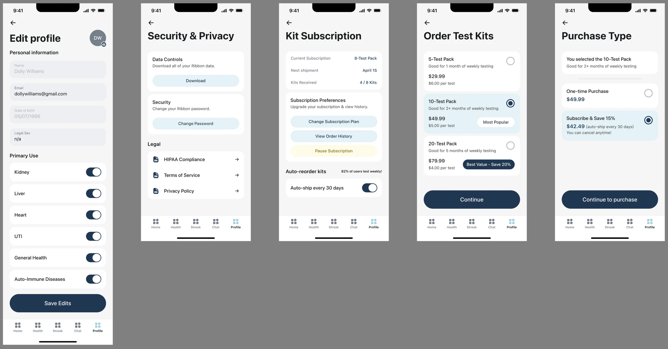
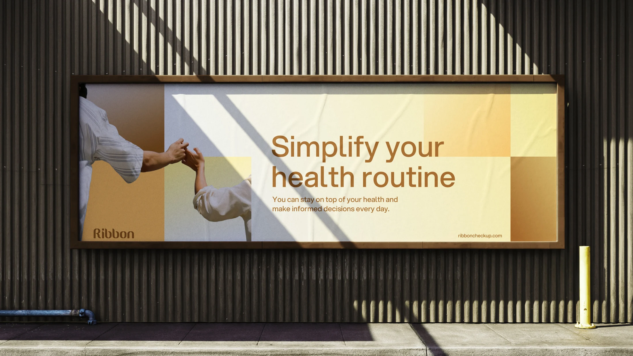
The approach connected the brand and product within a shared design system. The visual language draws on the color calibration cards used in the testing process, combining modular squares, a distinctive wordmark, clear typography, soft gradients, and human photography. That direction carried across the website, marketing, and full product experience, with consistent hierarchy and interface patterns making the journey easier to follow.
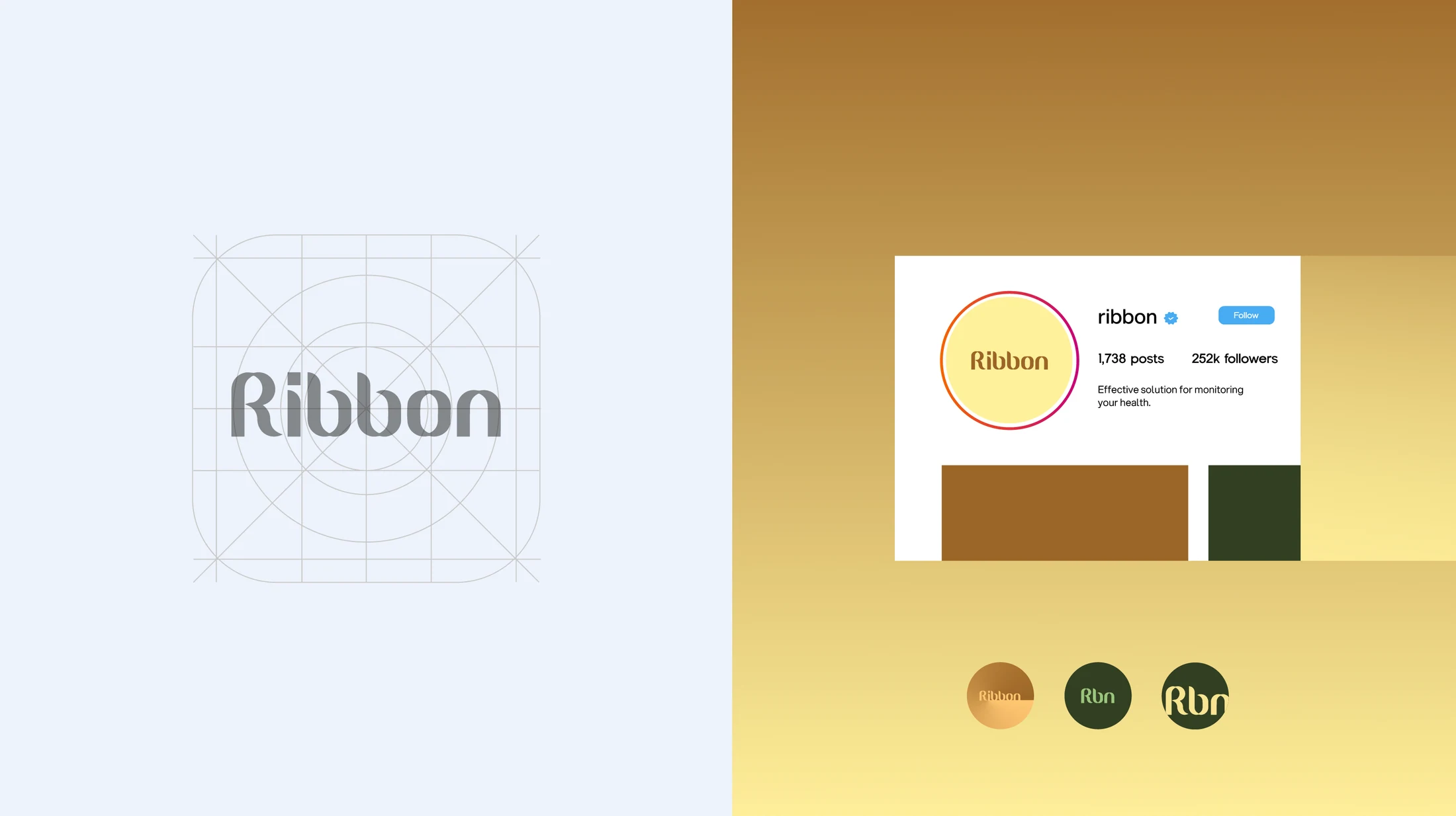
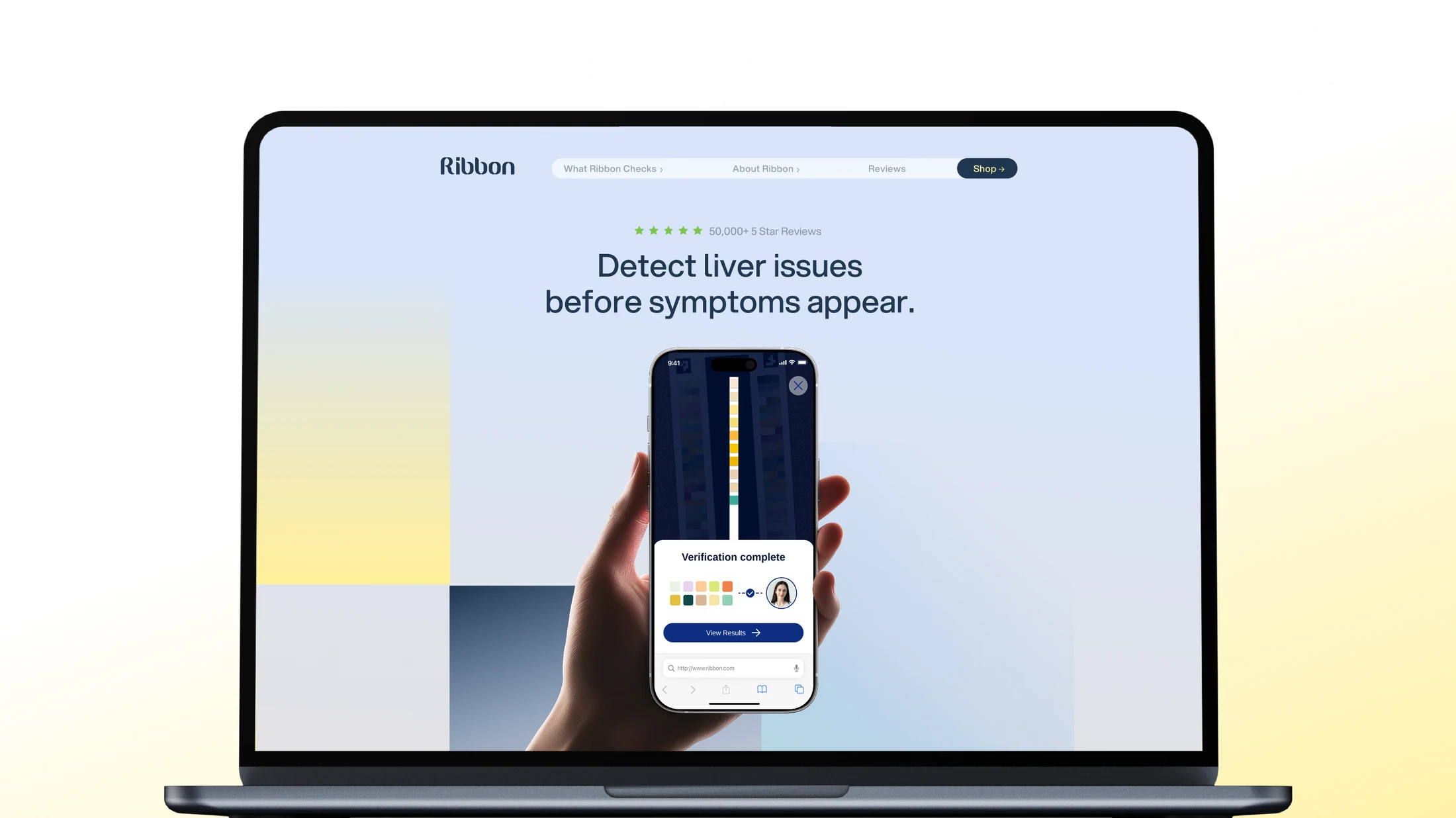
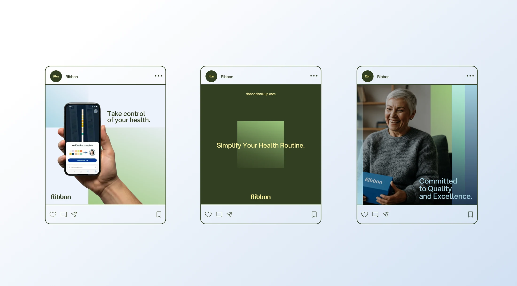
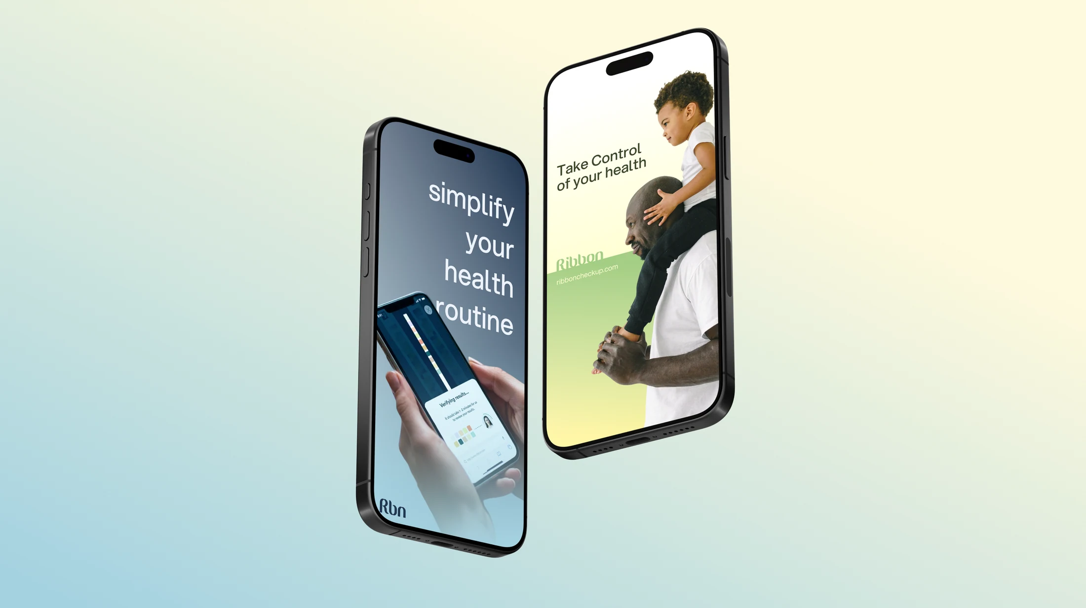
The work covered Ribbon’s brand identity, website, marketing assets, and entire product. UX architecture, app flows, and a design system connected the product’s structure, screens, and interactions. The engagement brought product design and creative direction together, carrying a consistent visual language across the app, customer-facing website, and marketing. The selected work shows the logo system, typography, graphic language, website presentation, social campaigns, mobile applications of the brand, and outdoor advertising.
The work established a shared design foundation across Ribbon’s brand, digital experience, and marketing. Consistent visual cues and information hierarchy connect the healthcare offering across touchpoints and provide a basis for future product and campaign development.
The Head of Product & Creative Director role covered product design and creative direction across the brand identity, website, marketing assets, and full product experience.