Prism
Problem
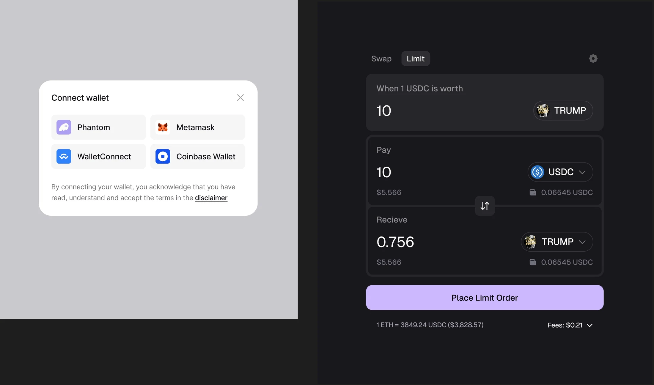
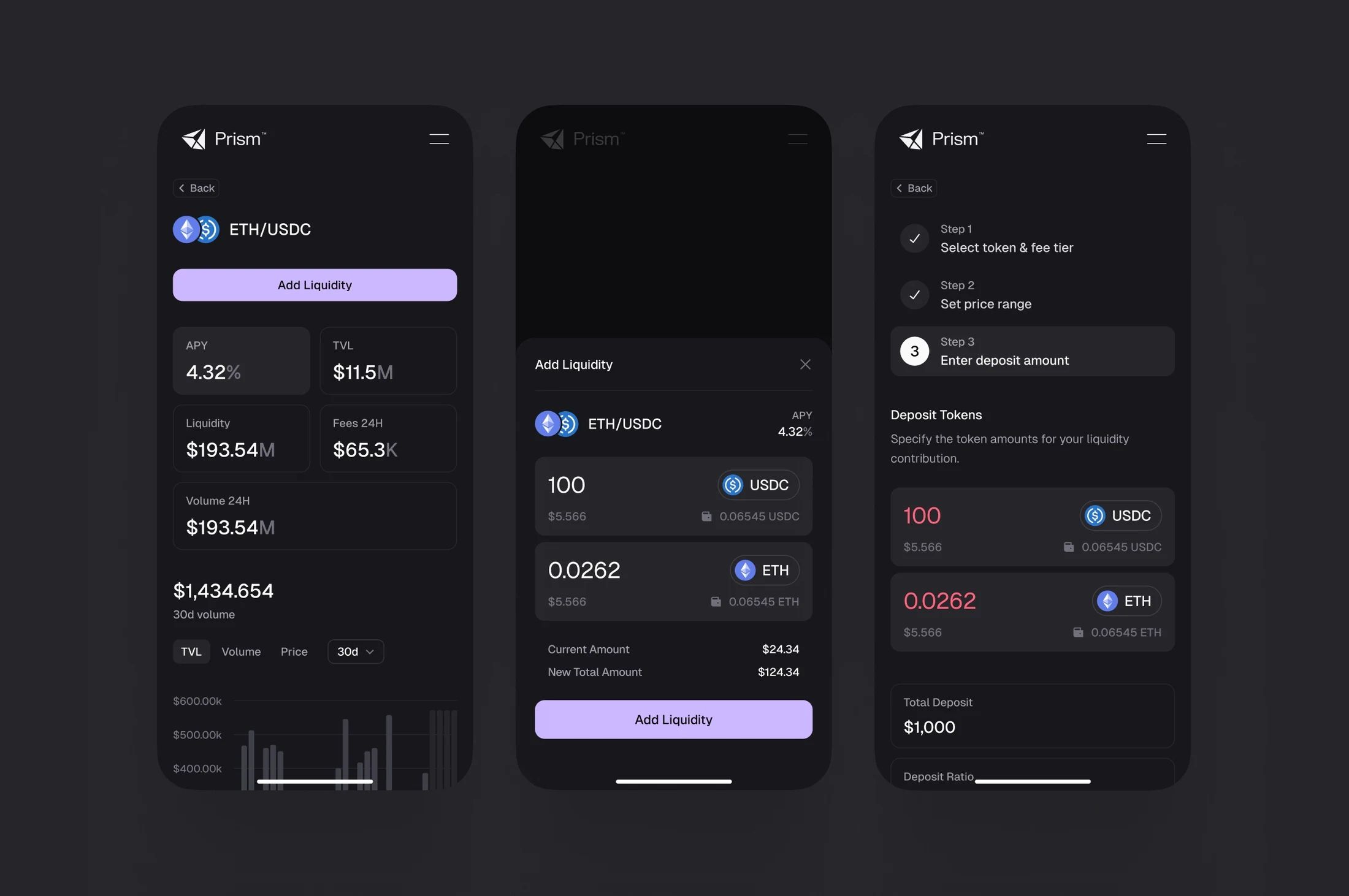
The design challenge was to connect a distinctive brand personality with clear interfaces for wallet connection, trading, and liquidity flows.
My Decision
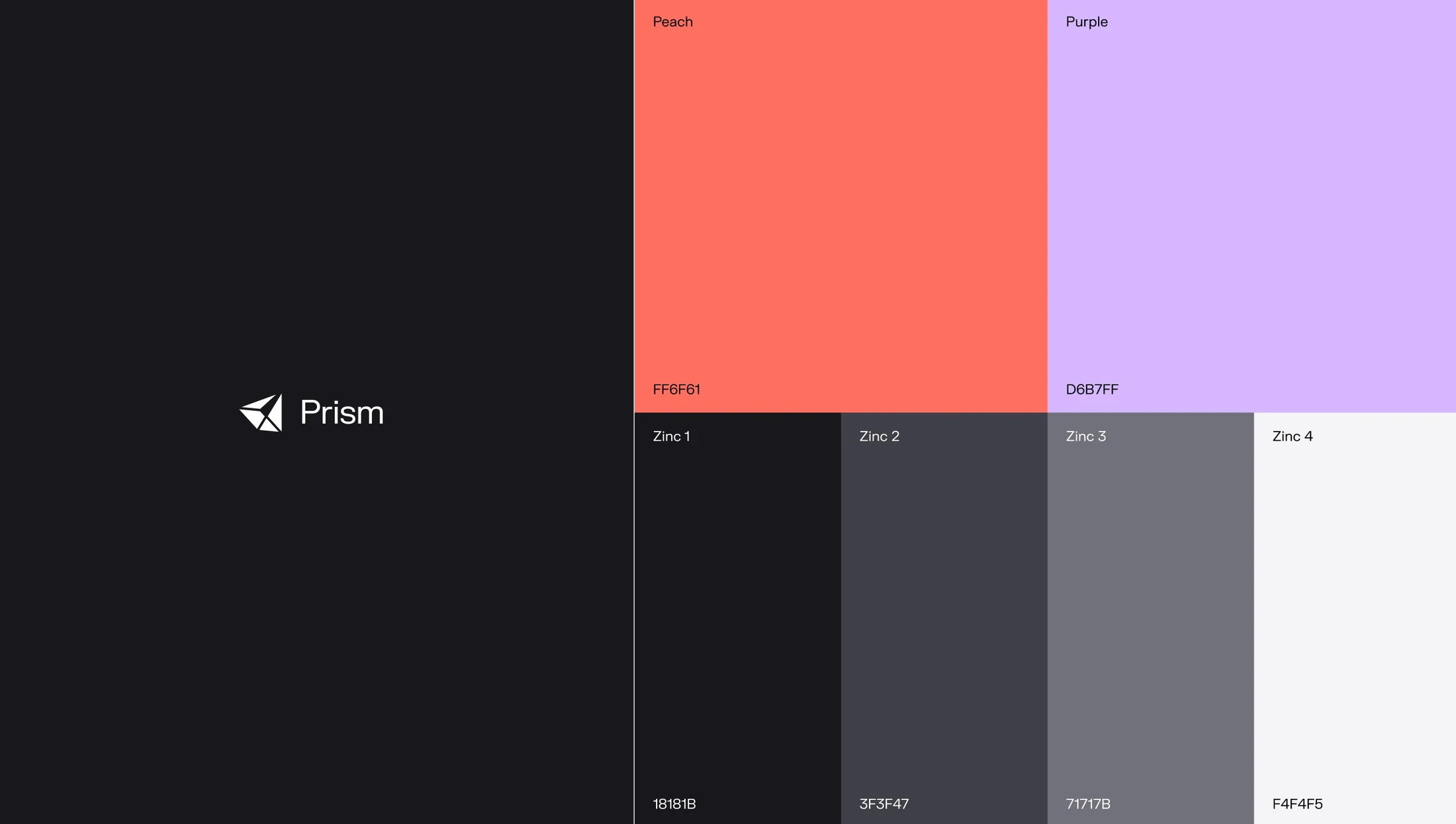
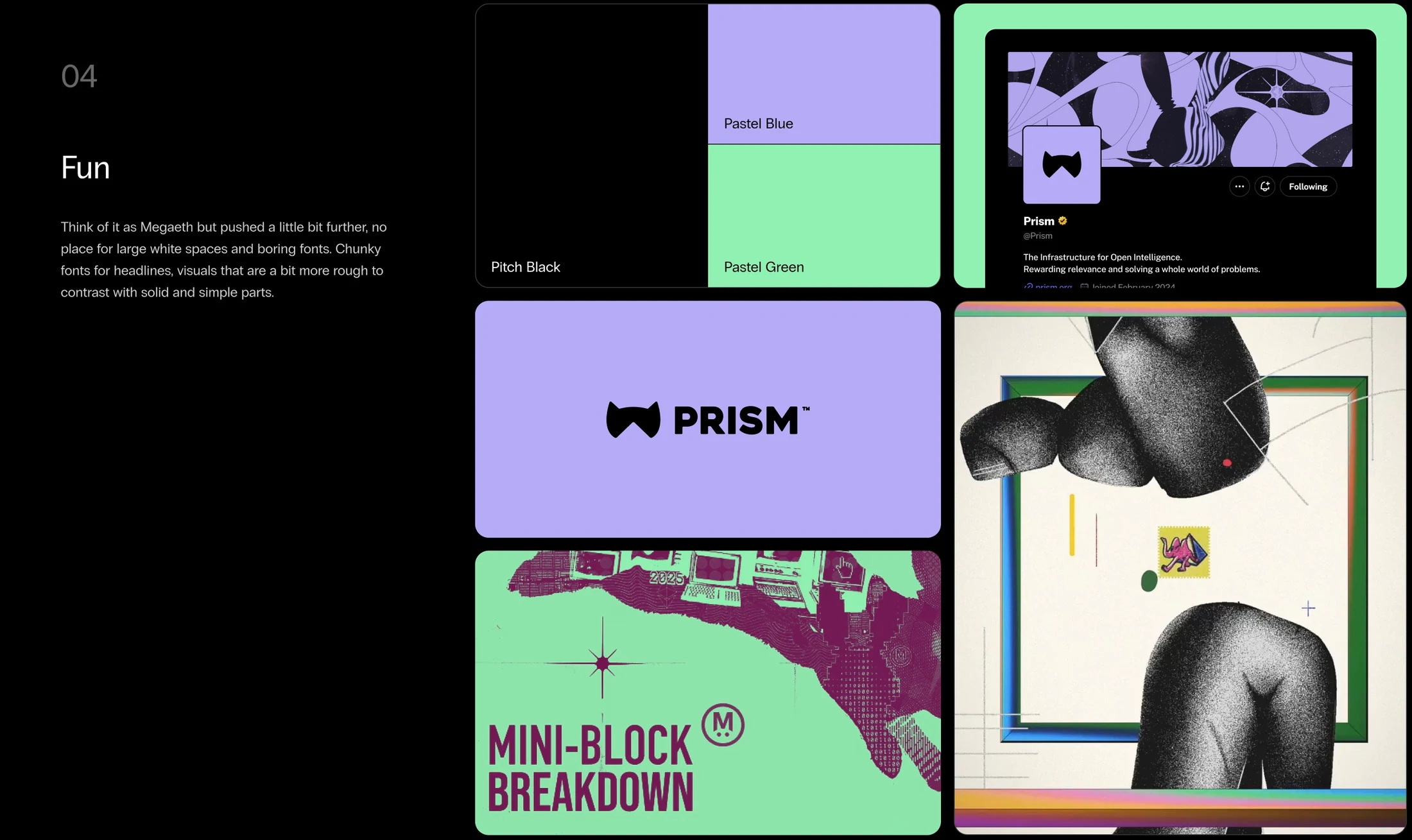
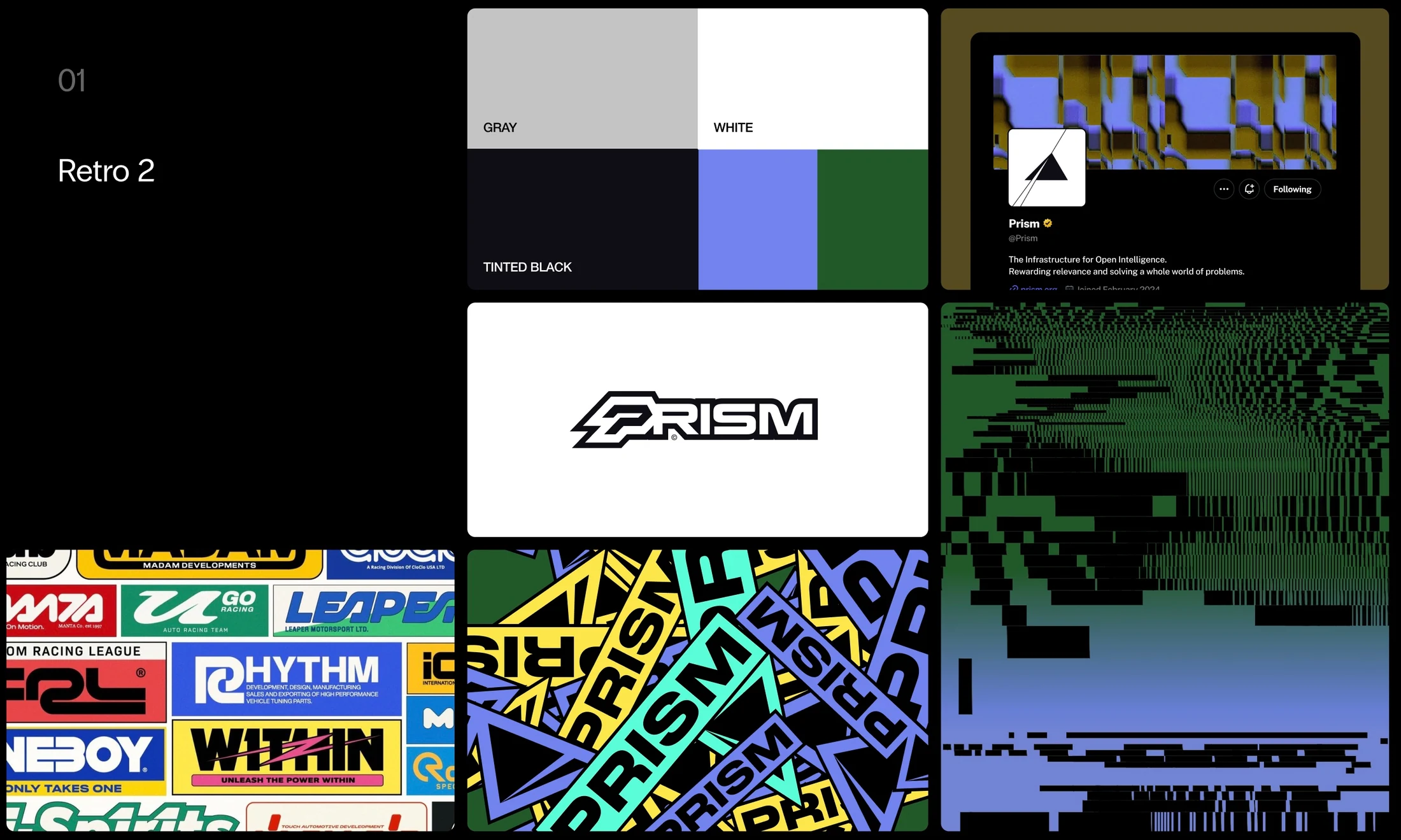
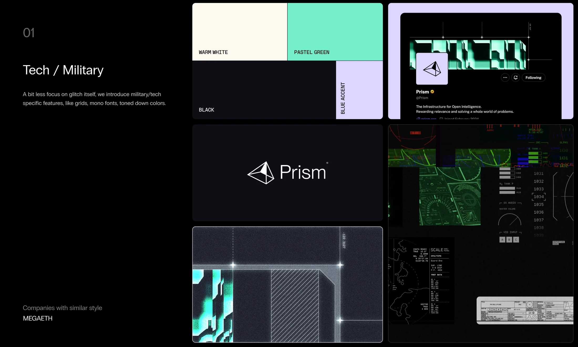
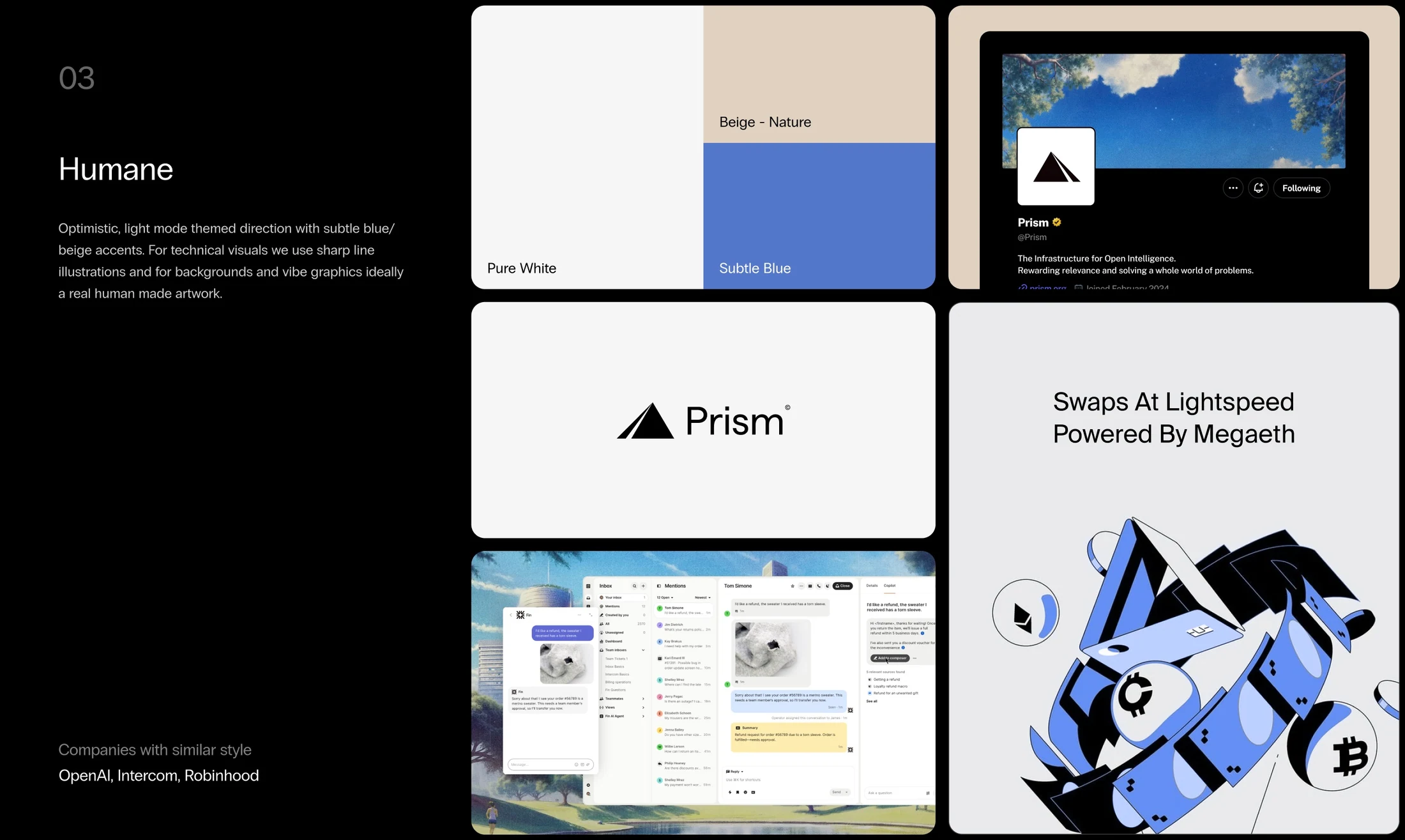
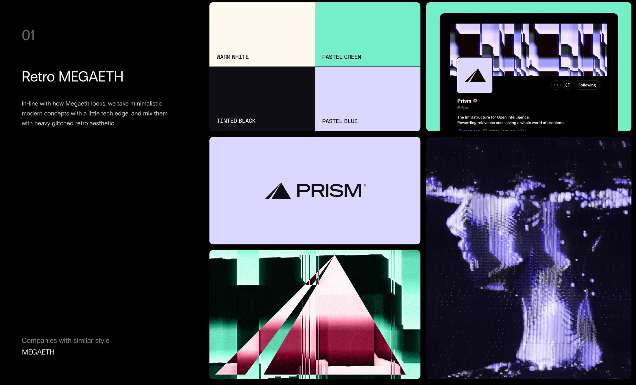
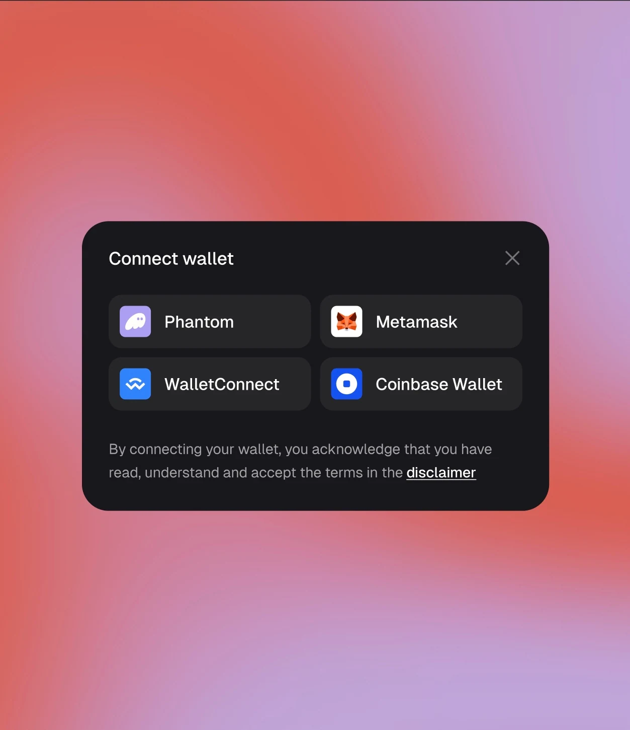
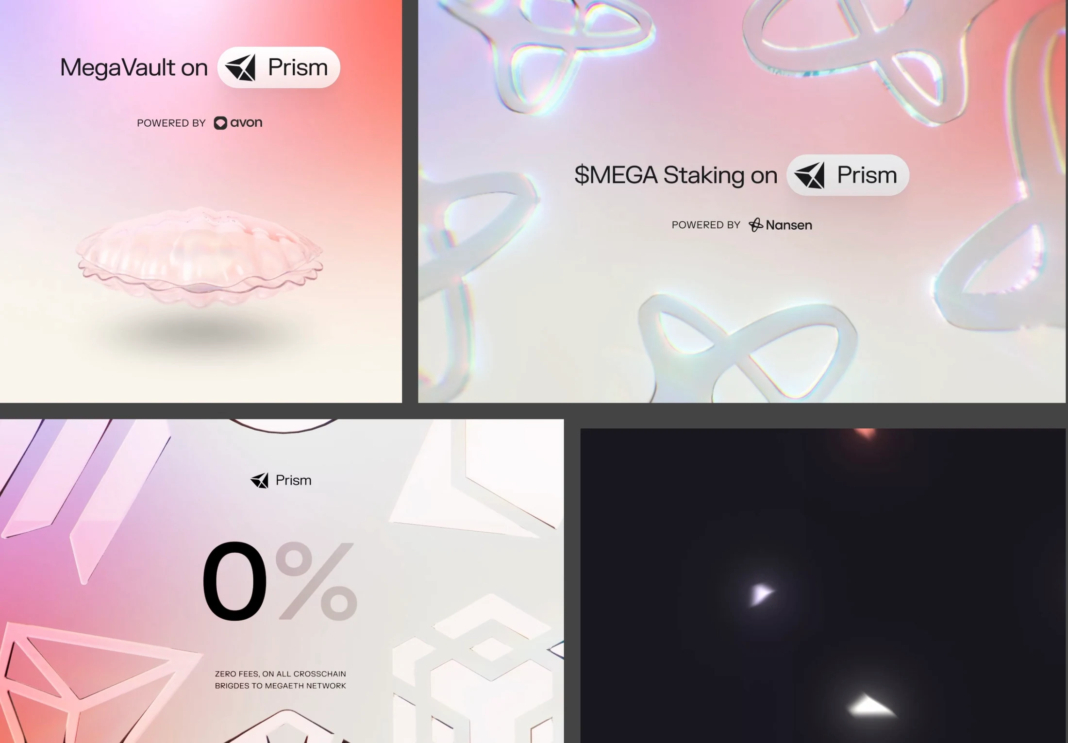
The exploration compares playful, retro, technical, and human-centered visual directions. The product screens pair dark neutral surfaces with purple accents, while peach and purple gradients extend the identity into campaign imagery.
What I Built
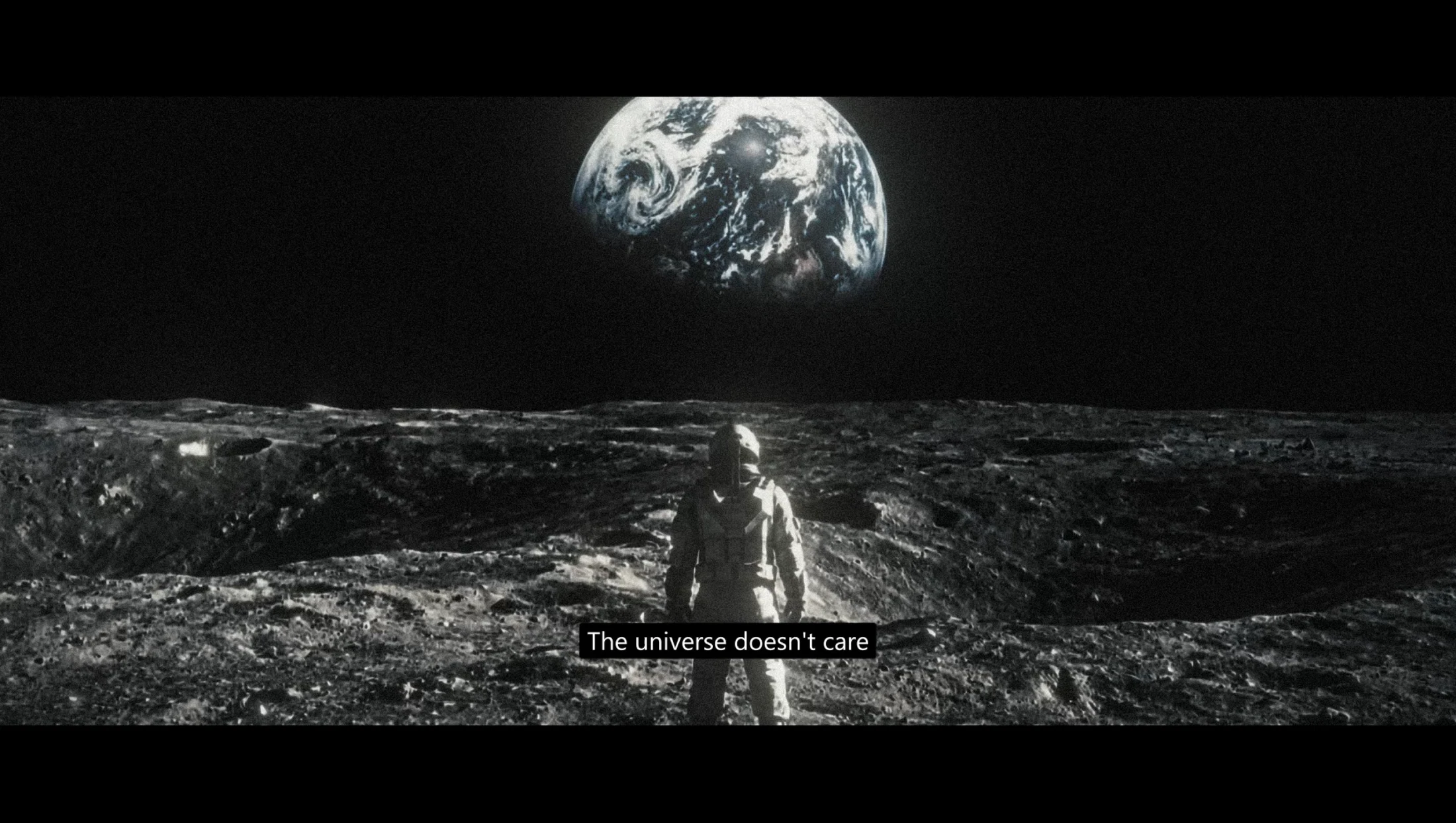
The work includes visual direction boards, logo and palette studies, wallet connection screens, limit-order interfaces, mobile liquidity flows, and campaign compositions. The reference imagery documents the broader creative exploration.
What Changed
The selected work connects brand exploration with concrete product and campaign applications, showing how a shared visual language can carry across different touchpoints.
Key deliverables
- Brand direction studies
- Logo and color exploration
- Wallet connection interfaces
- Trading interface design
- Mobile liquidity flows
- Campaign visuals