Otonomos
Problem
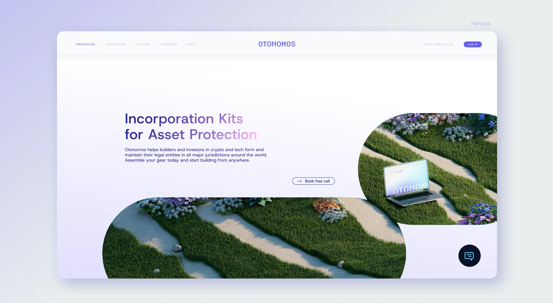
Otonomos’ brand and website felt outdated. The redesign needed to refresh the identity and carry a consistent visual direction across the website, product, and marketing.
My Decision
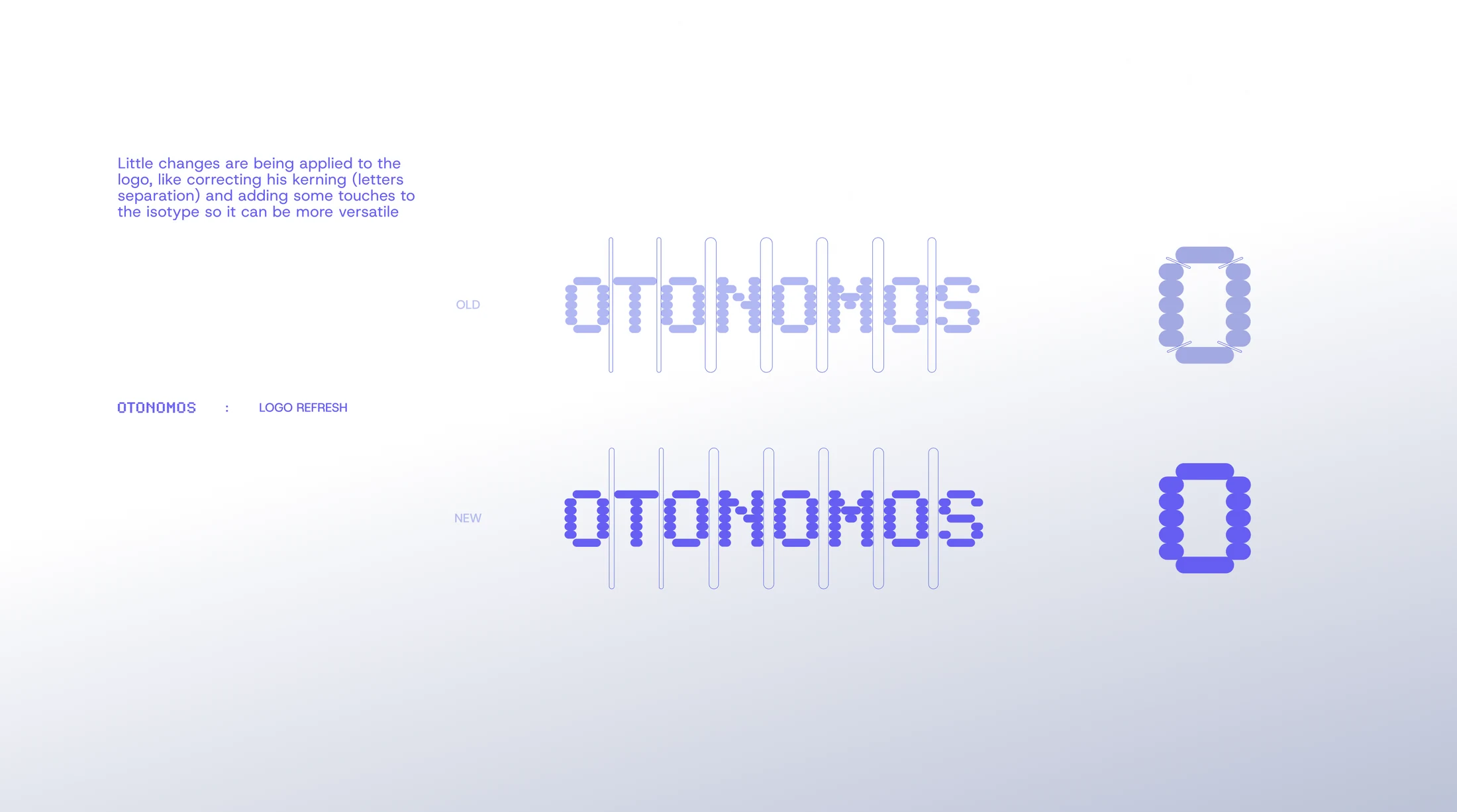
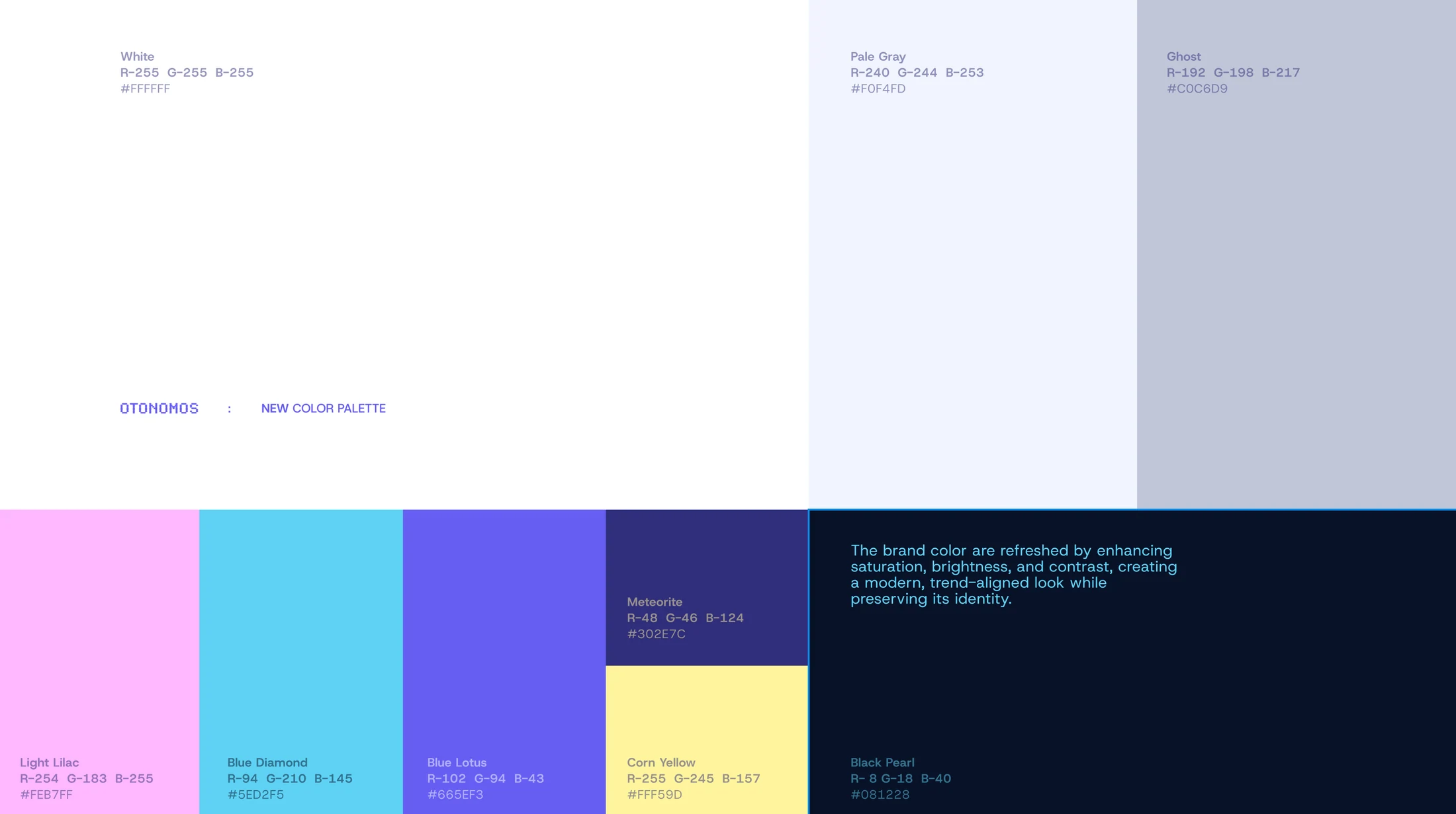
I approached the project as one connected redesign. I retained the recognizable character of the identity while refining the logo, refreshing the palette and typography, and extending that visual language into the product experience.
What I Built
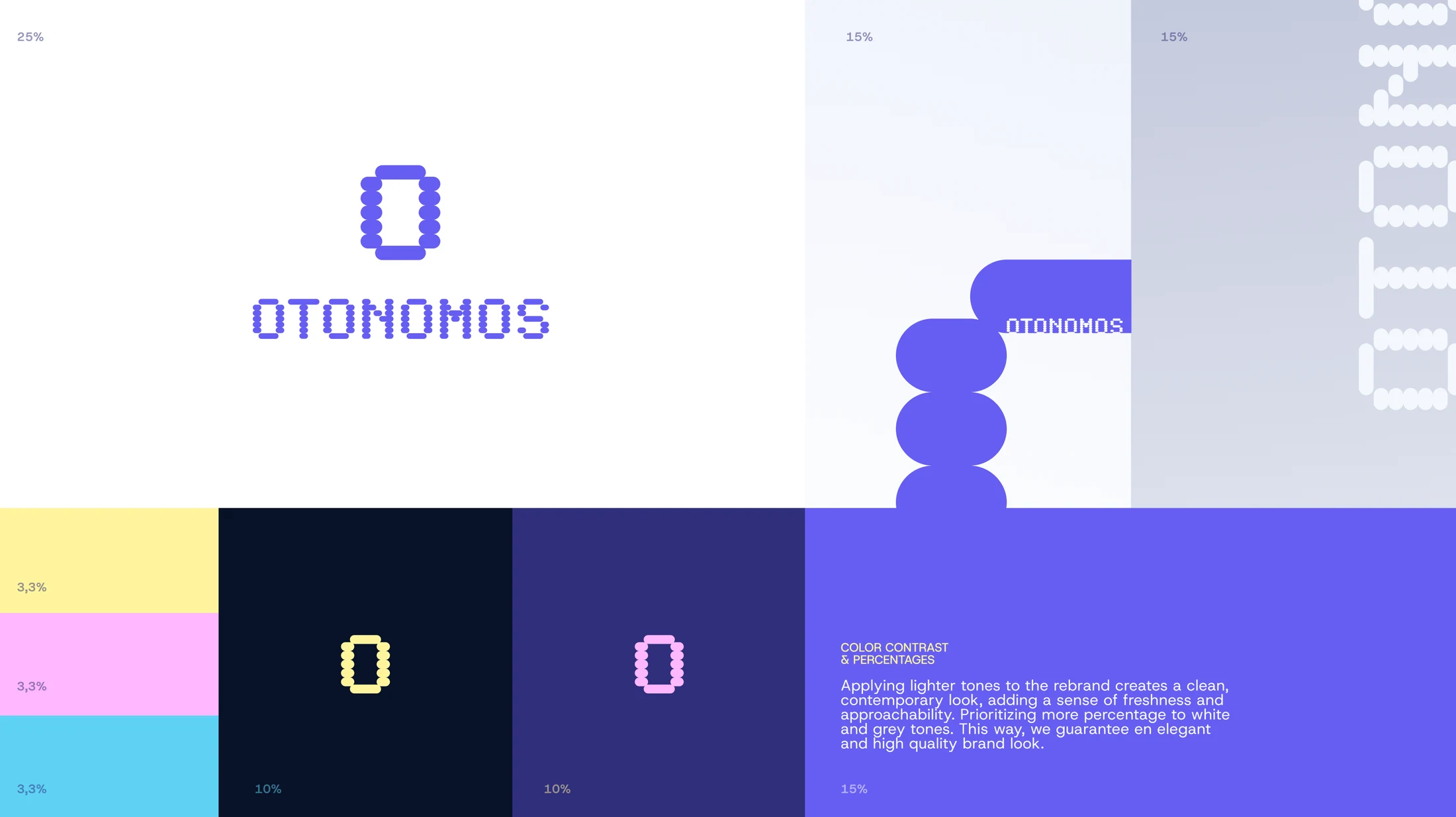
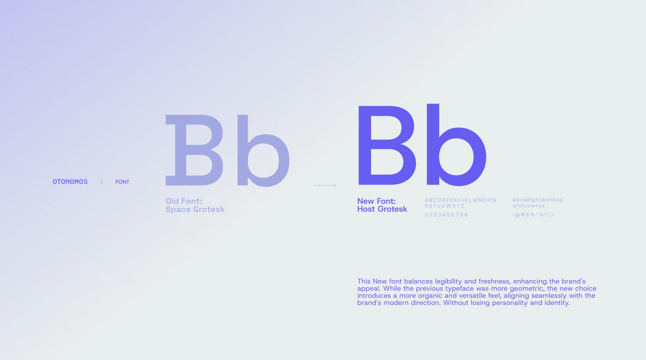
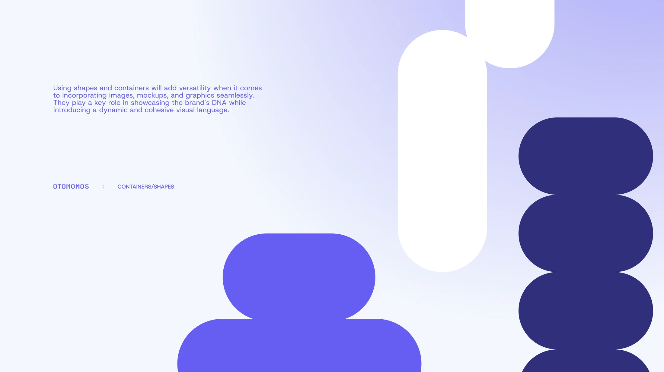
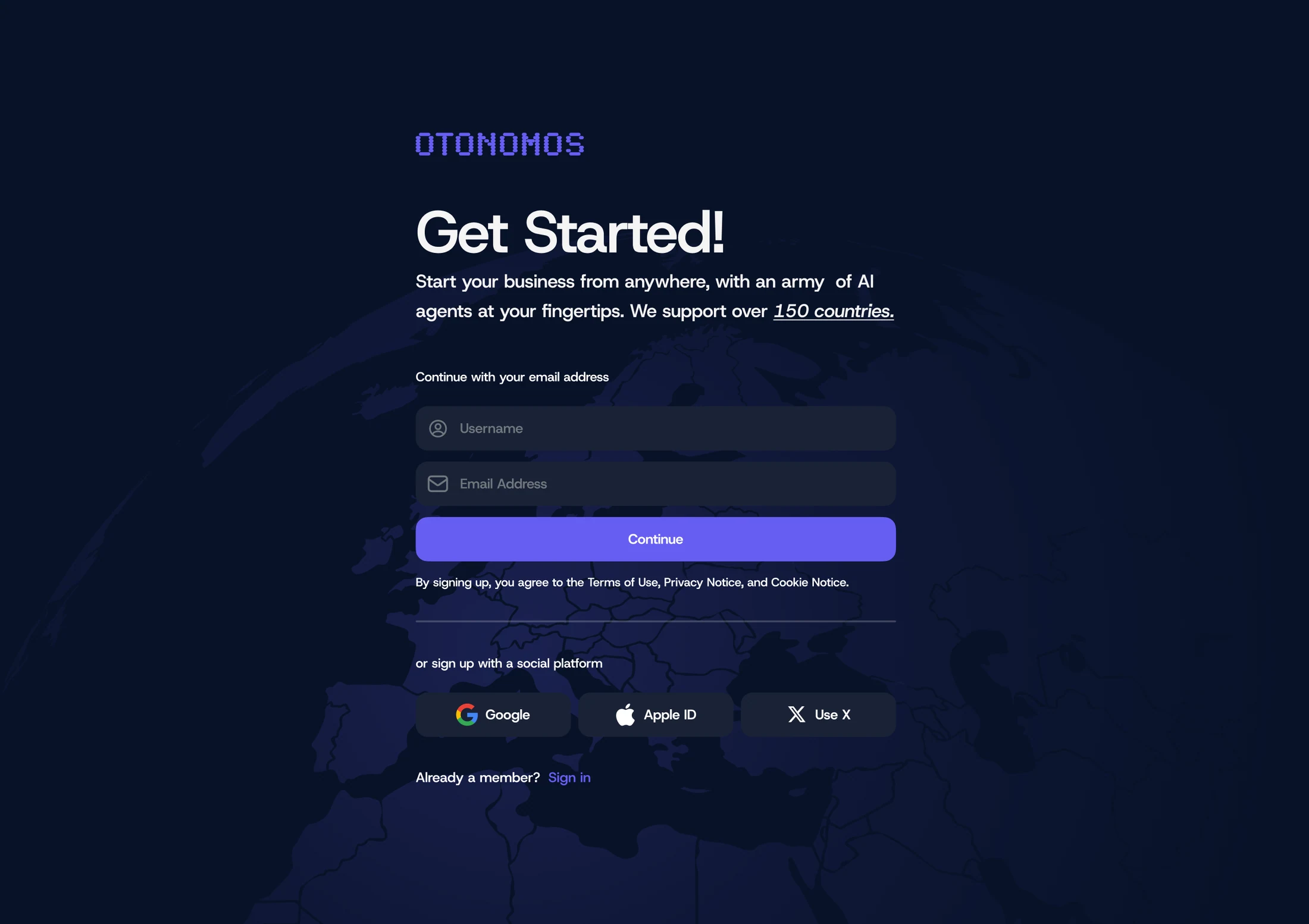
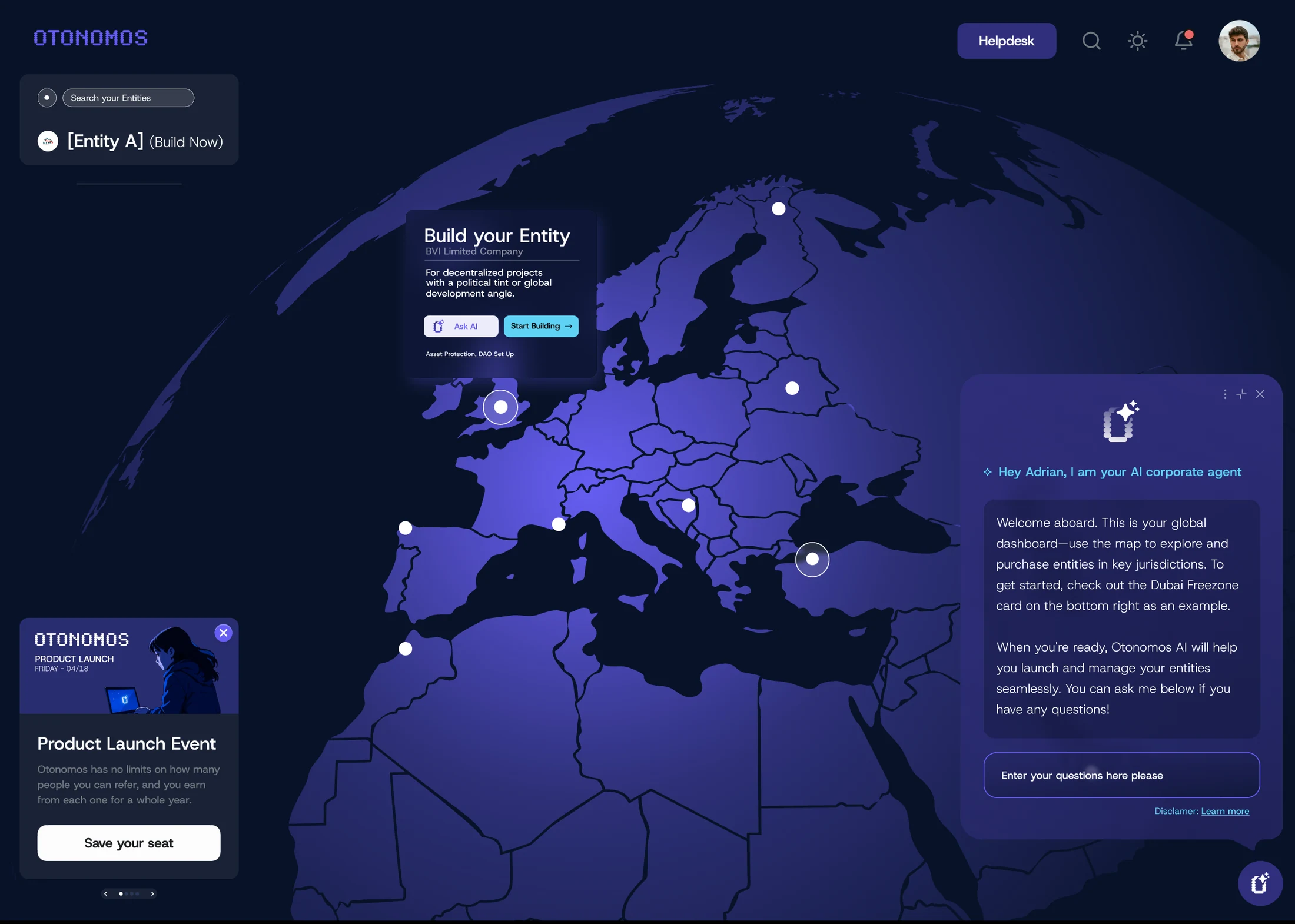
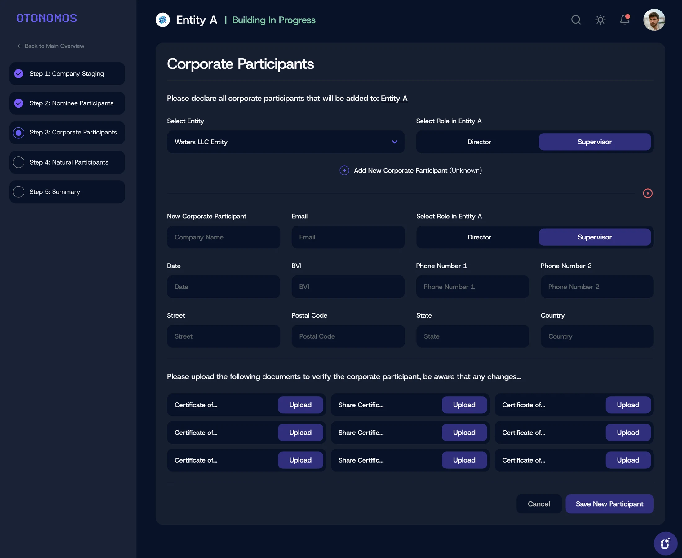
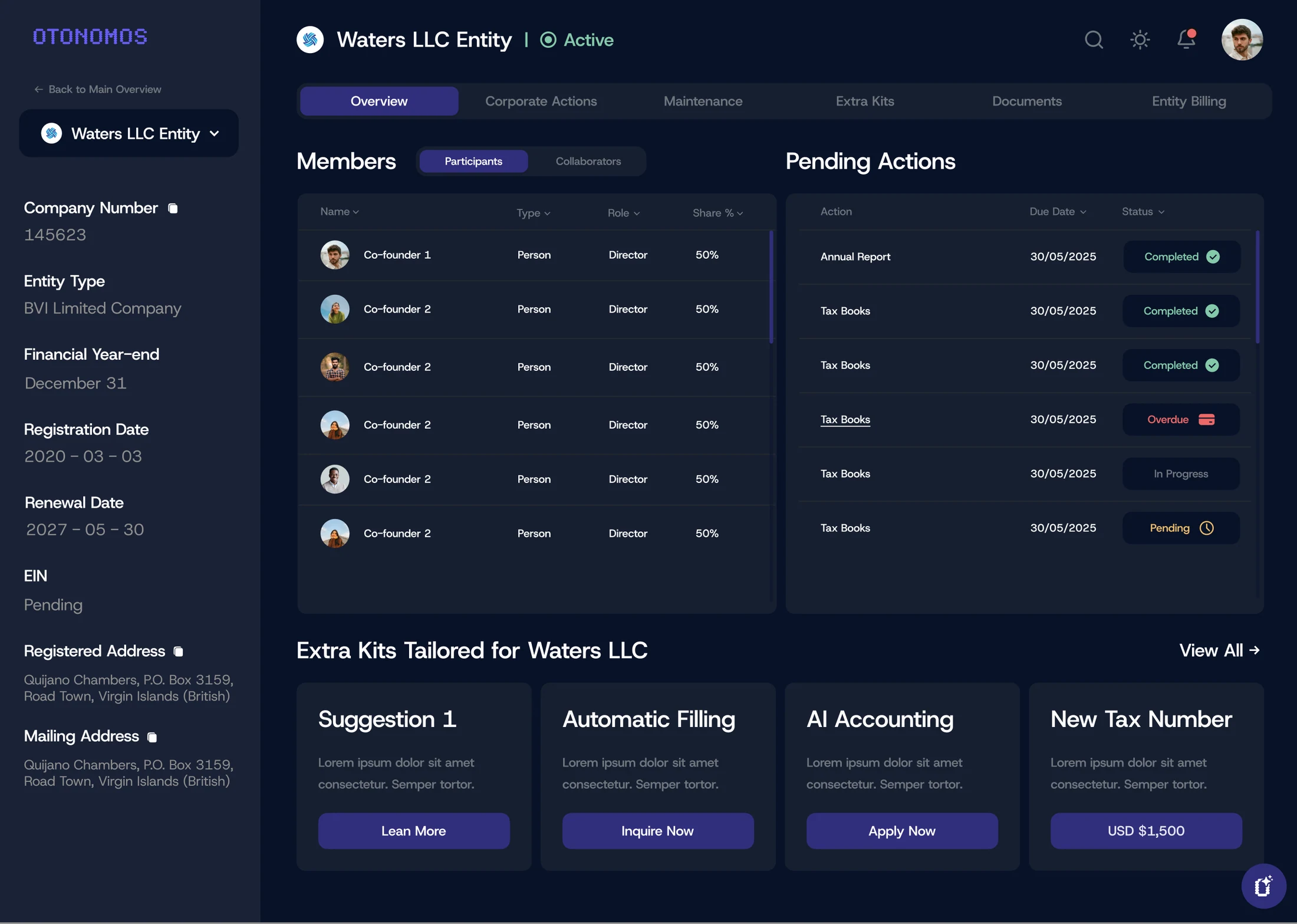
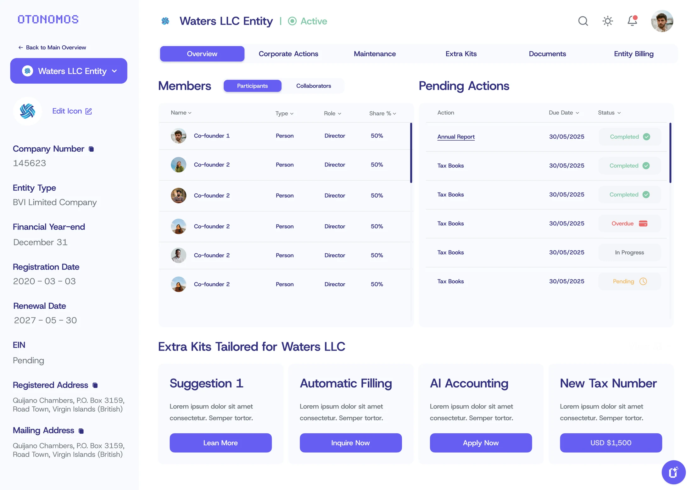
I led the creative direction and hands-on design across branding, product, and marketing. The work included logo refinements, a refreshed color system, Host Grotesk typography, modular brand shapes, a website redesign, and product screens for sign-up, global entity exploration, participant onboarding, and entity management in light and dark modes.
What Changed
The redesign brought the brand, website, and product into a shared visual system. The supplied work shows a more consistent identity, clearer information hierarchy, and a common design language across customer-facing touchpoints.
Key deliverables
- Brand identity refresh
- Color and typography system
- Brand shapes and art direction
- Website redesign
- Product UI and onboarding
- Light and dark interface designs
- Marketing design
Team & collaboration
I owned design and creative direction across the full redesign.