Fasset
Problem
The design challenge was to translate a broad digital finance offering into a recognizable visual language that could work across brand guidelines, product-led communication, and campaigns. The system needed to balance clarity with a distinctive character across different formats.
My Decision
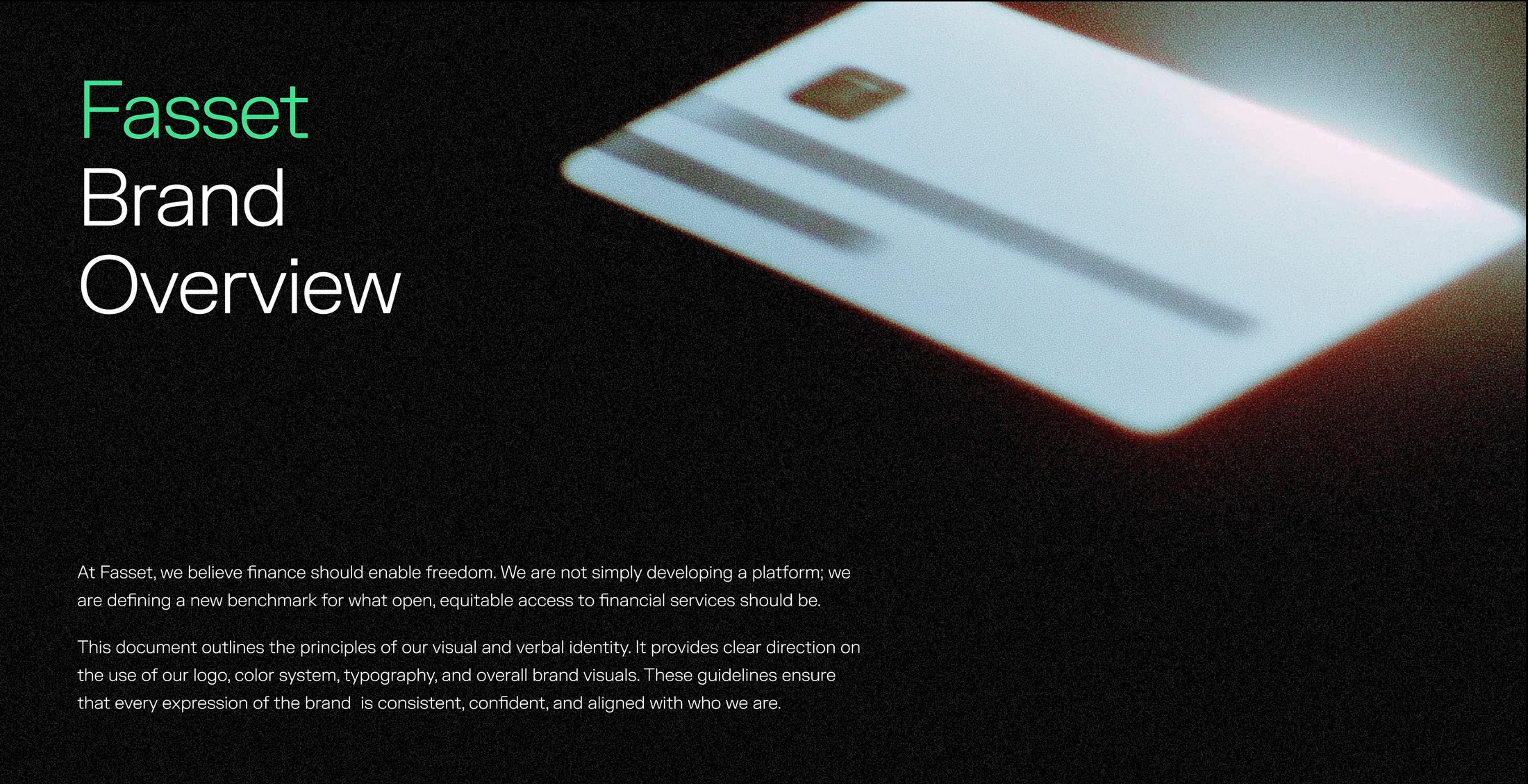
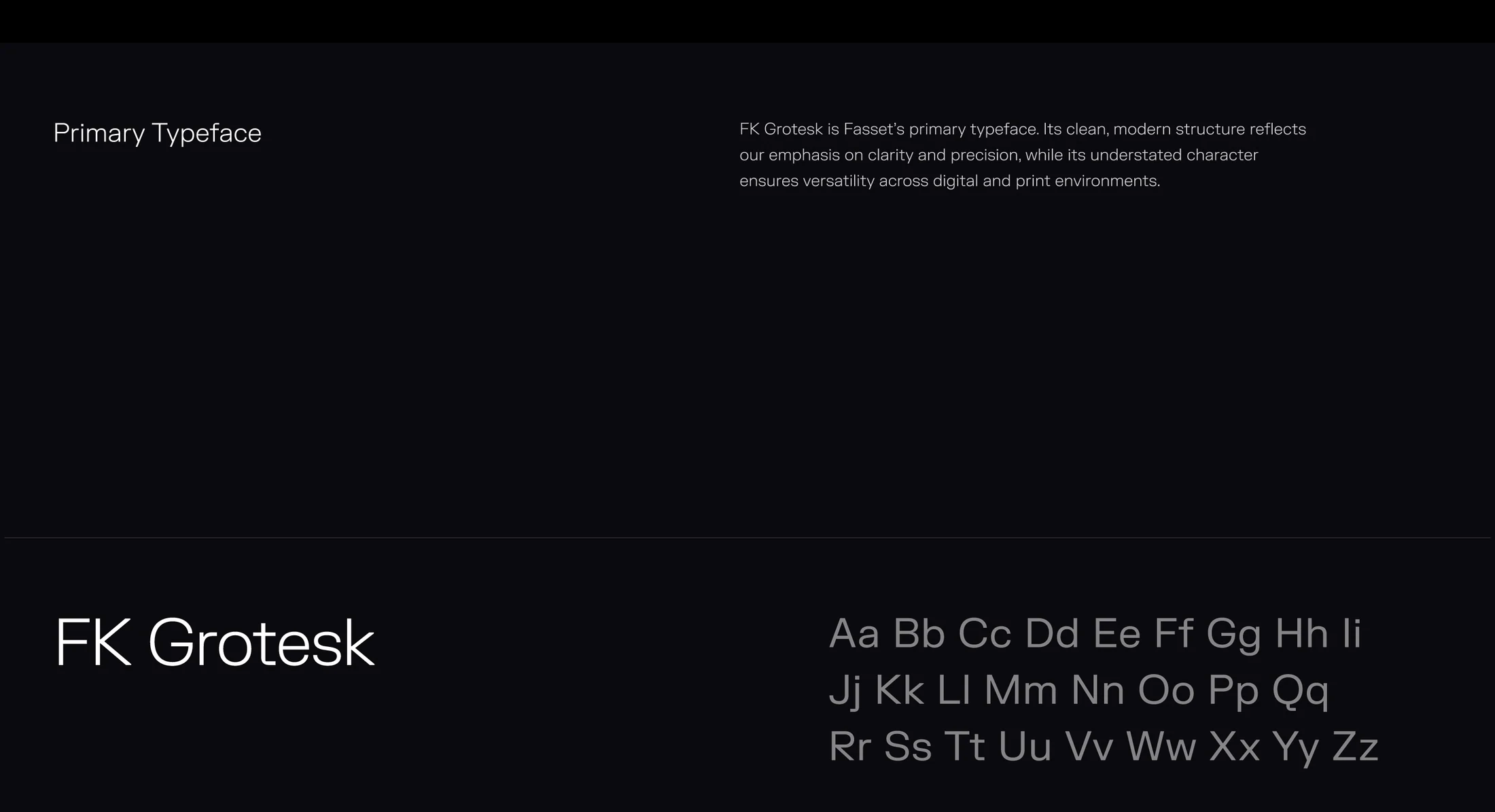
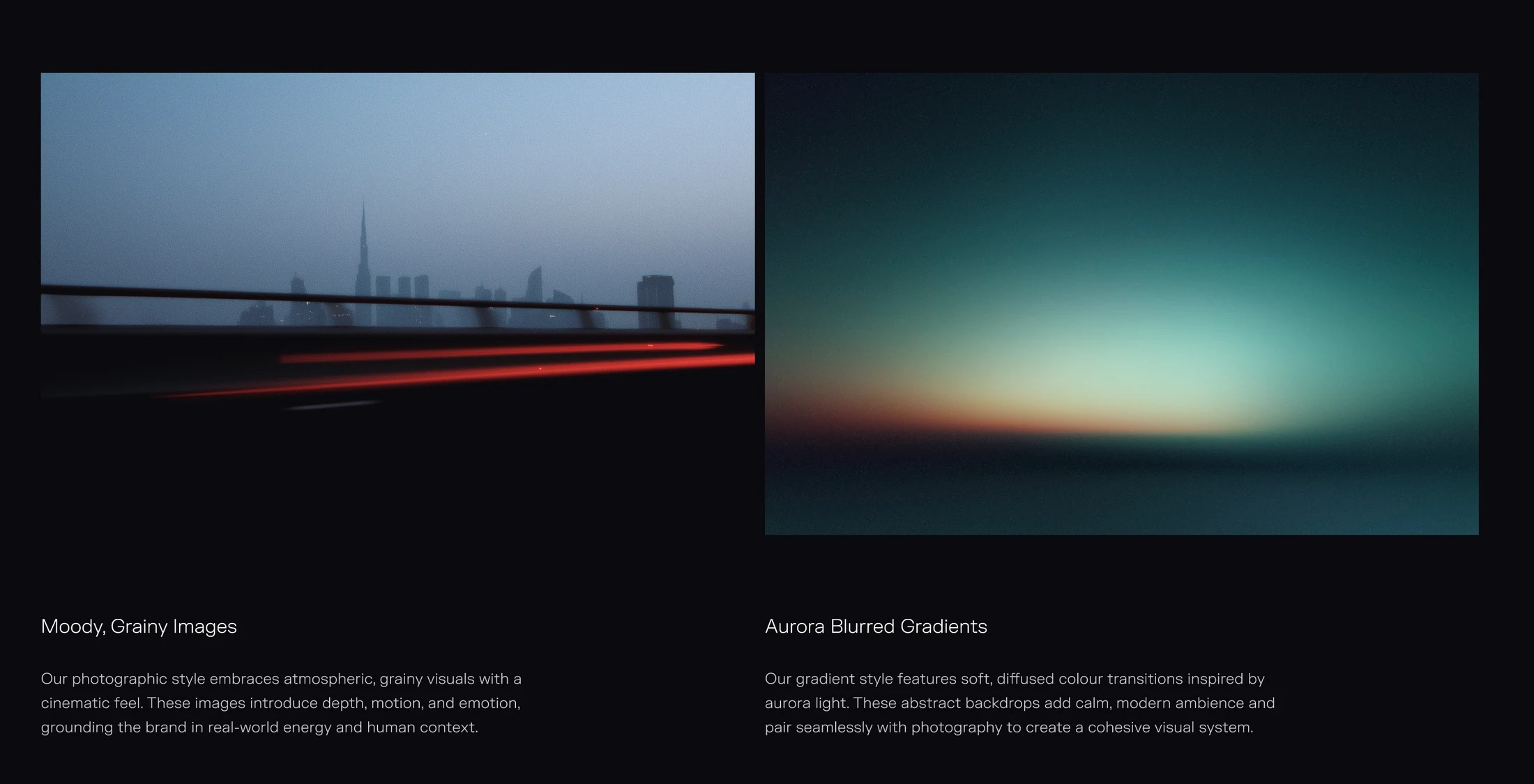
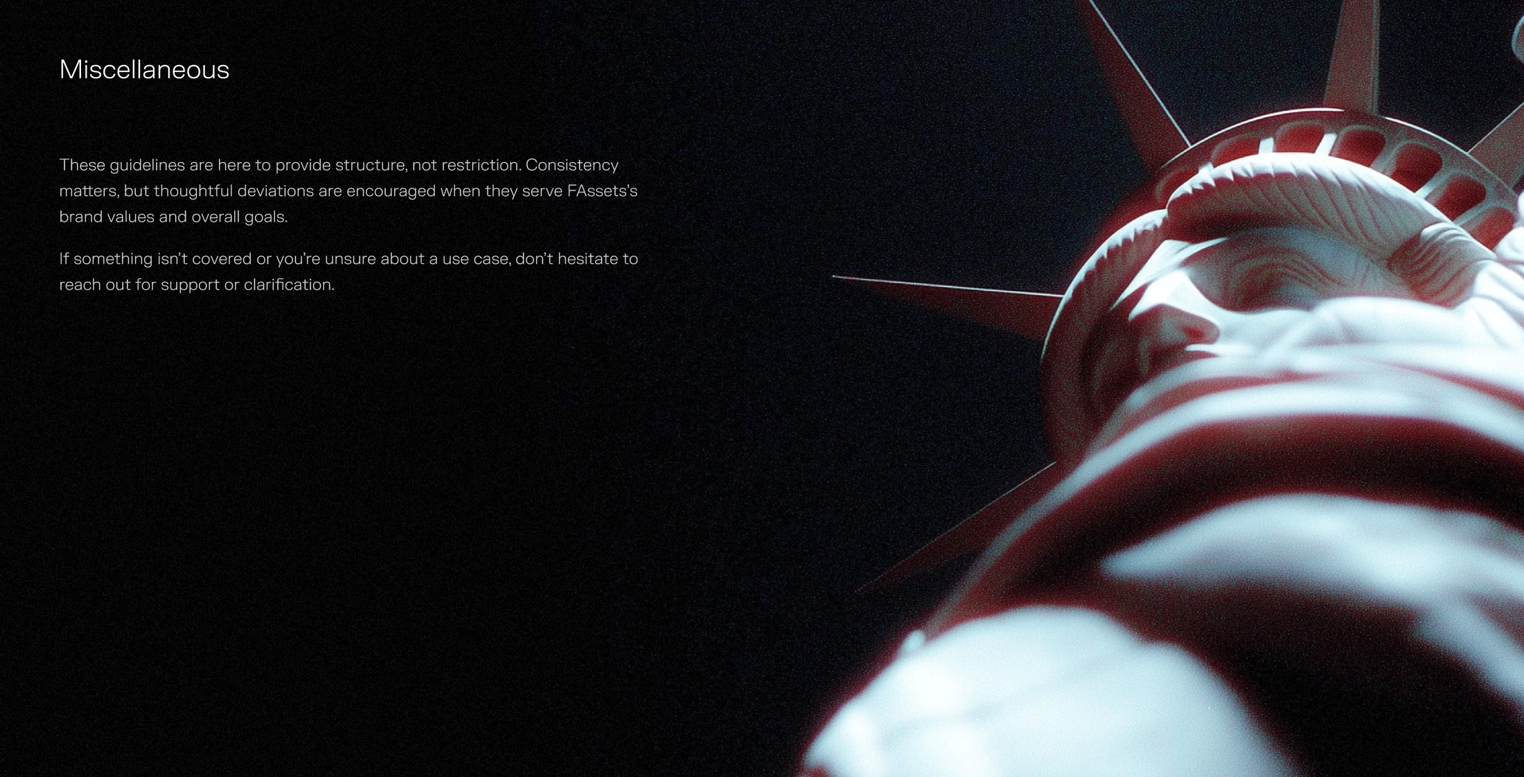
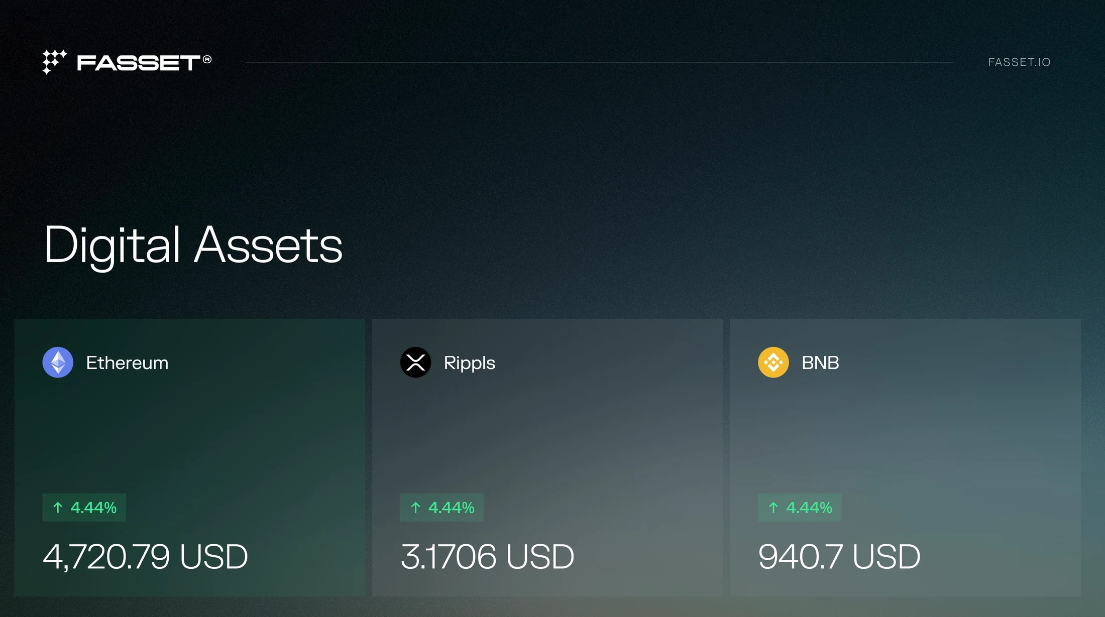
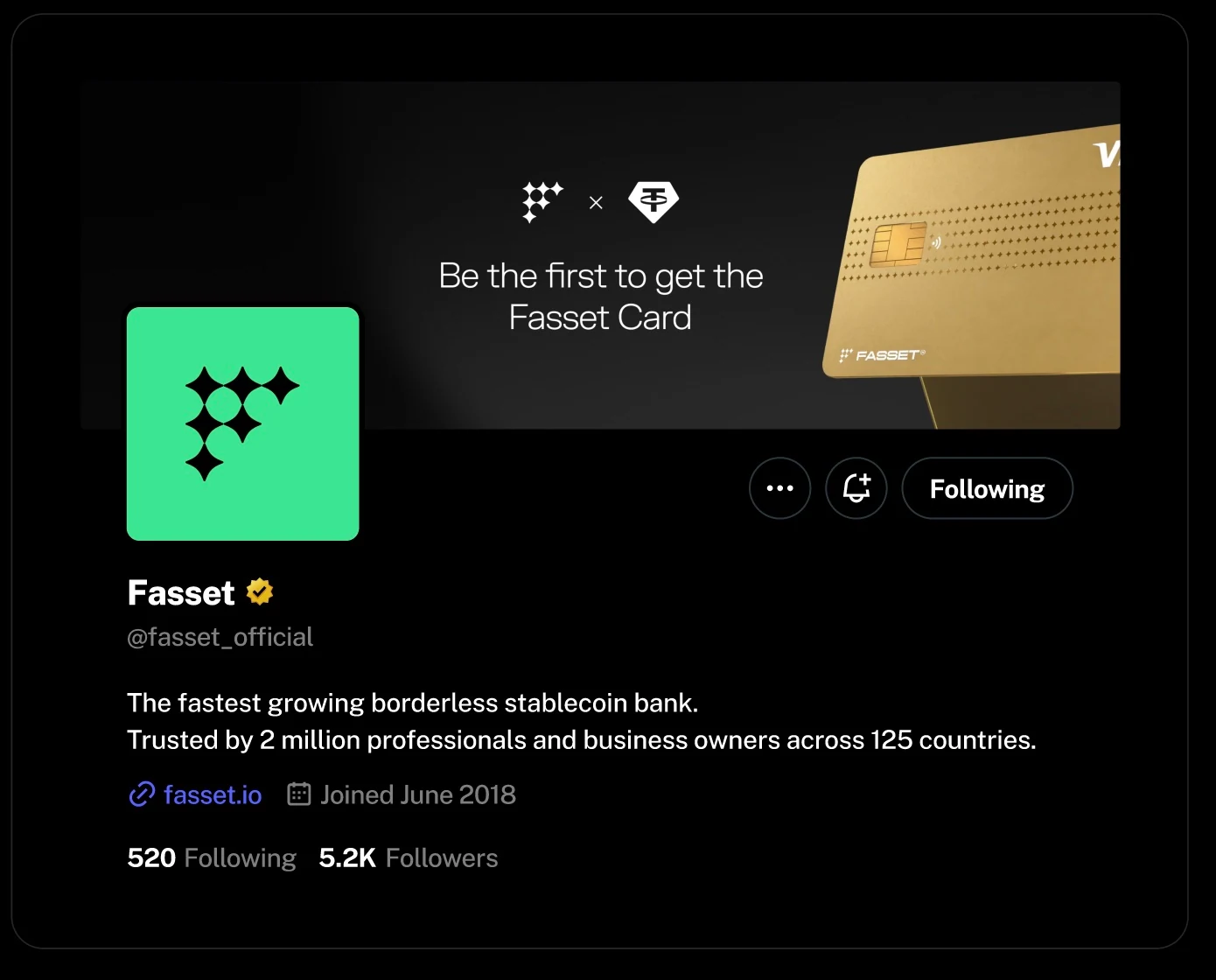
I connected a disciplined identity system with atmospheric visual storytelling. Neon and deep greens establish recognition, while dark backgrounds, FK Grotesk typography, grainy photography, and soft gradients create a consistent tone. The direction extends from practical logo and typography rules into campaign layouts, allowing product imagery, card designs, and partnership messages to share the same visual foundation.
What I Built
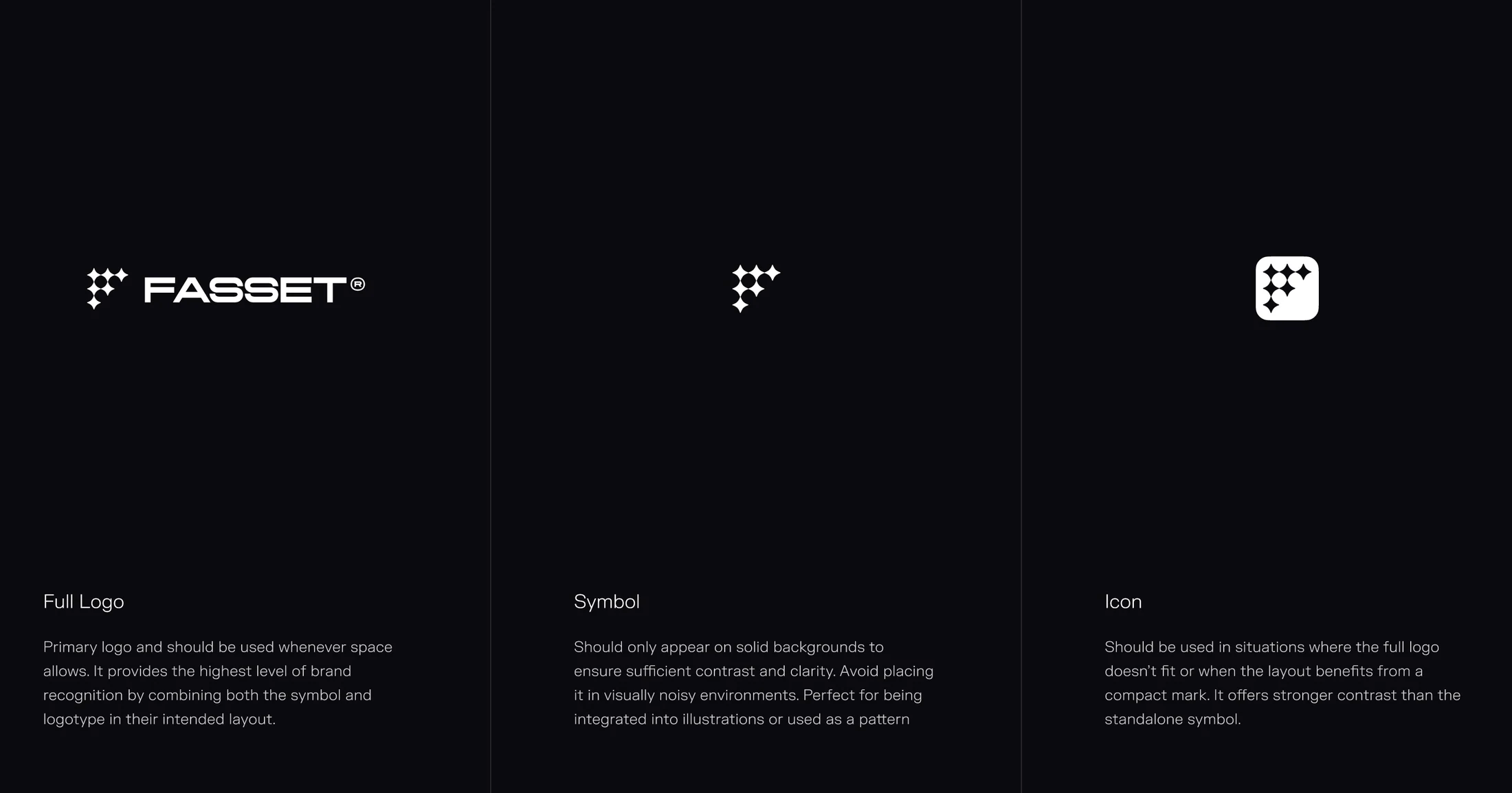
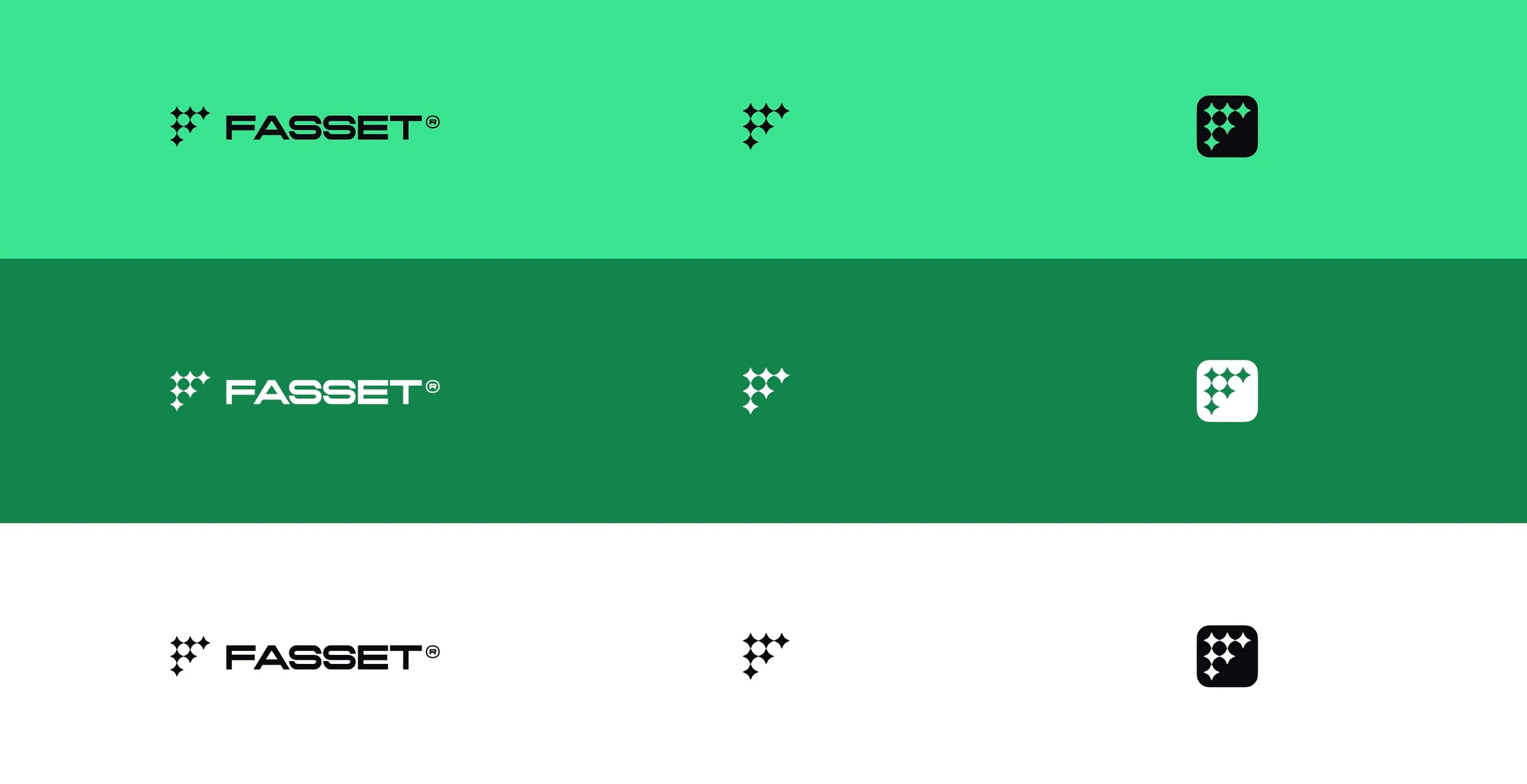
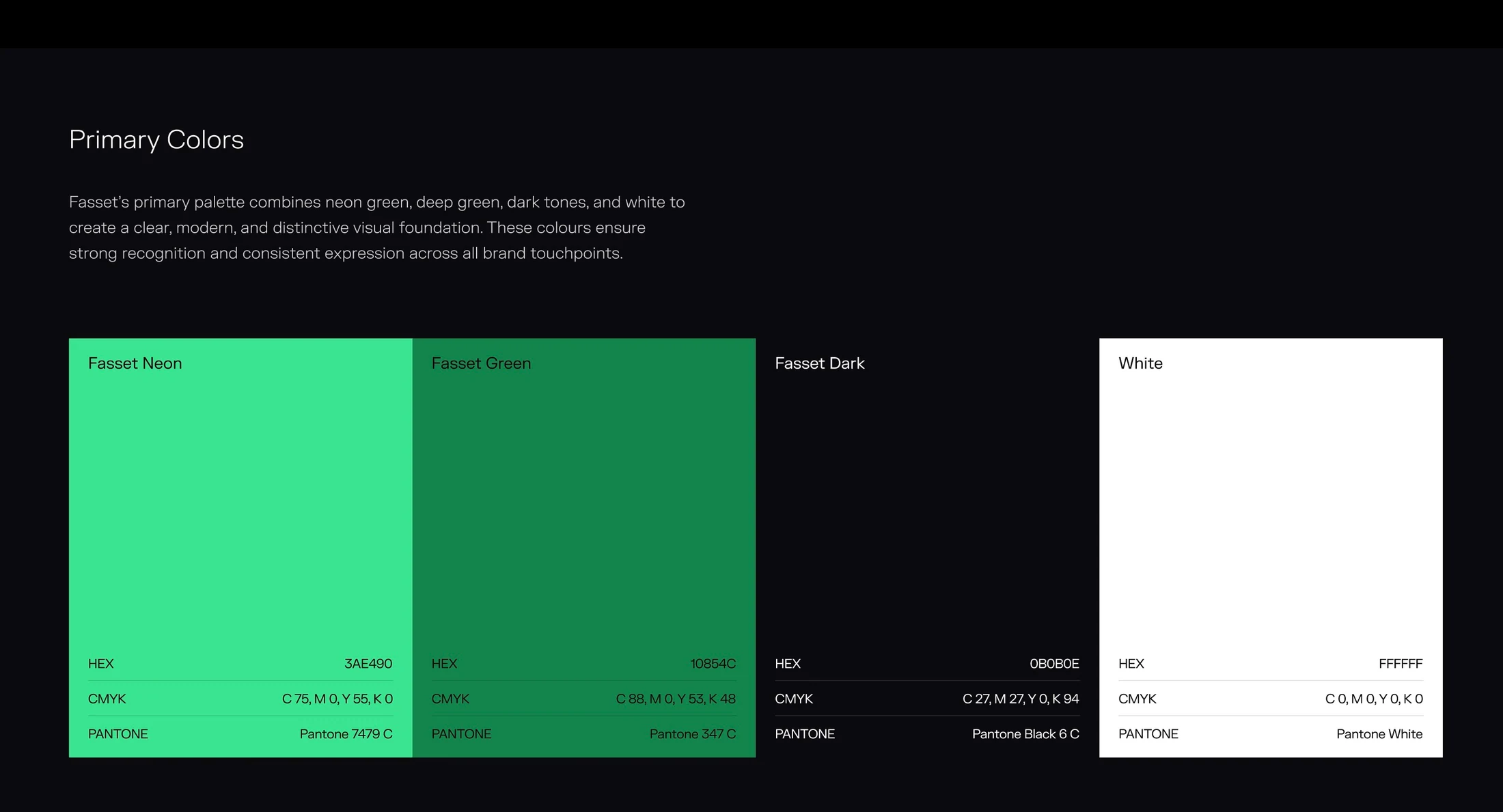
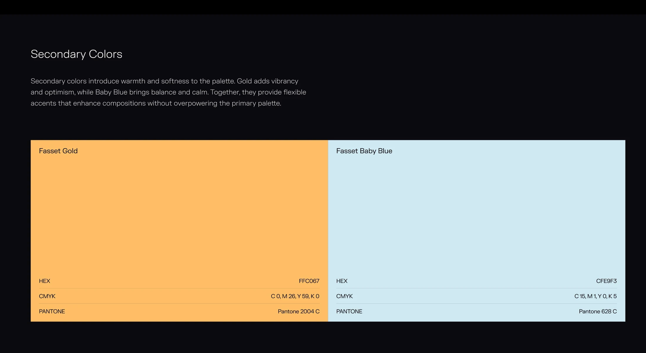
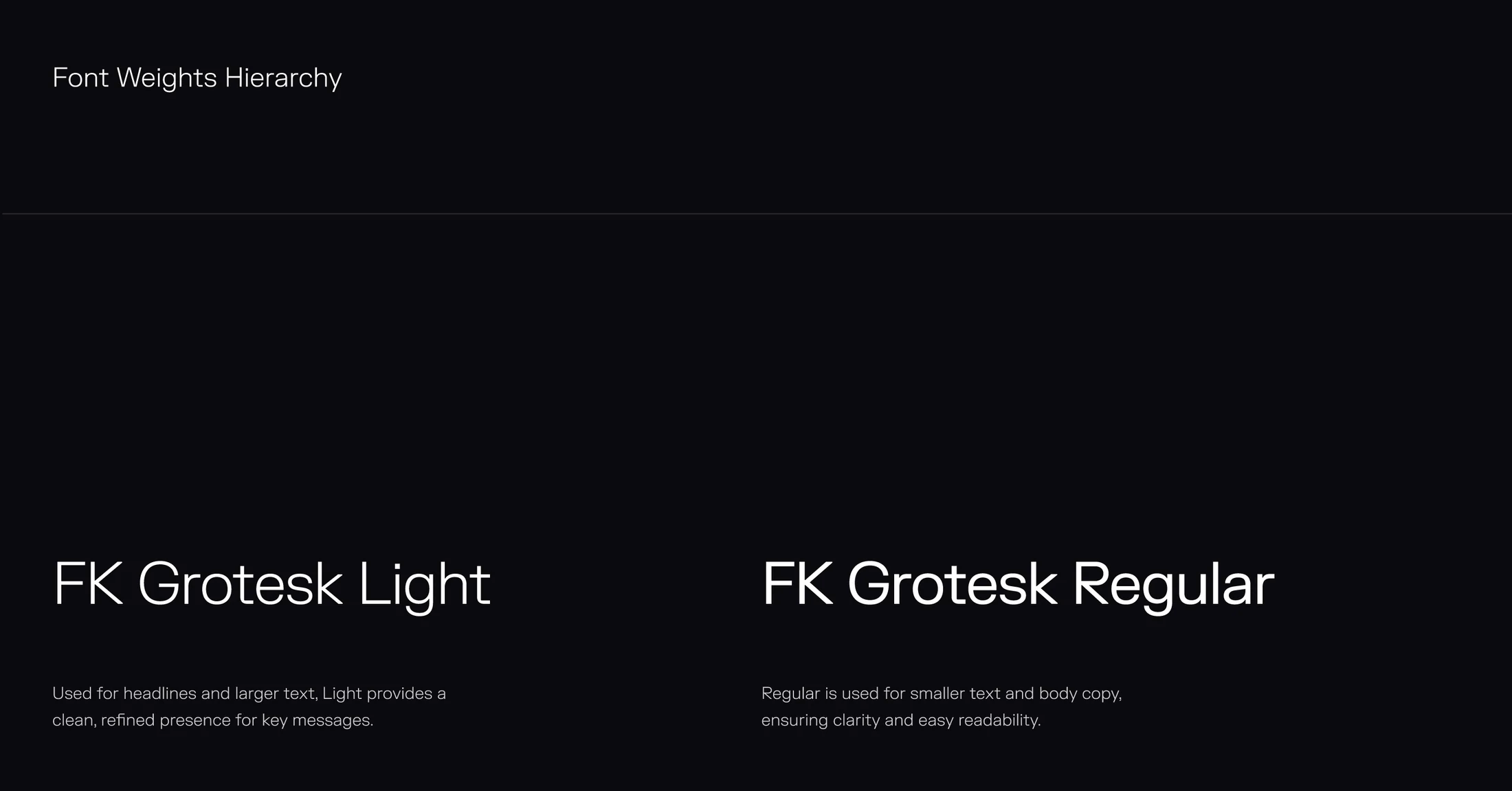
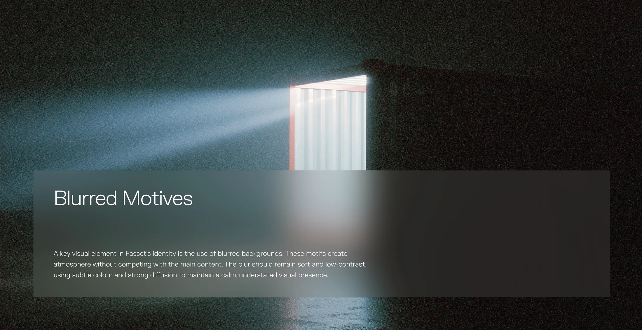
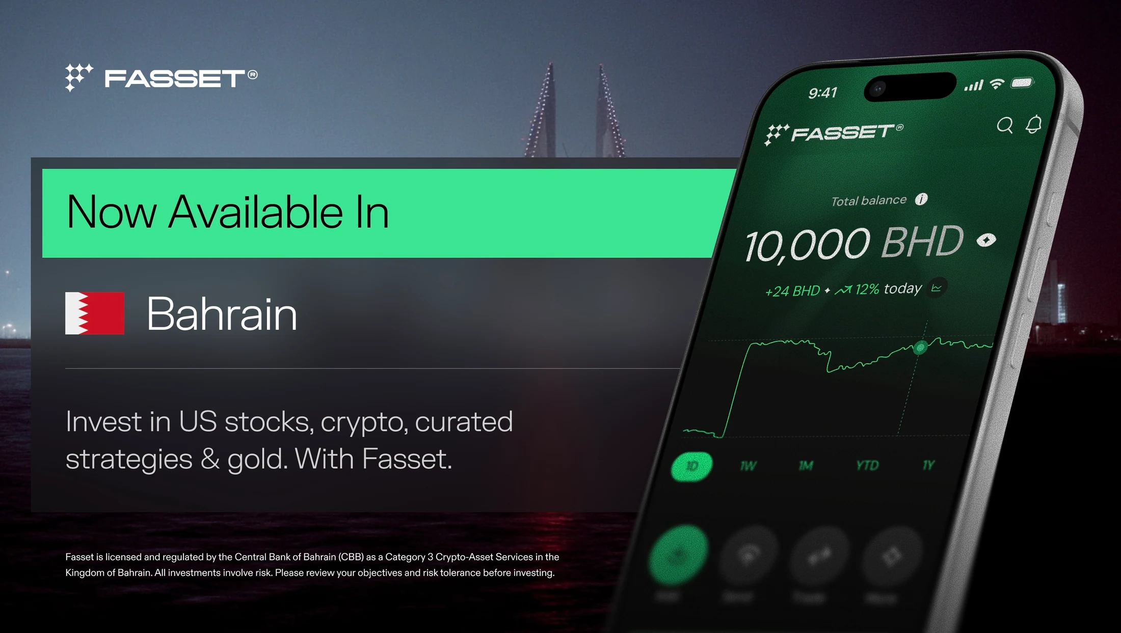
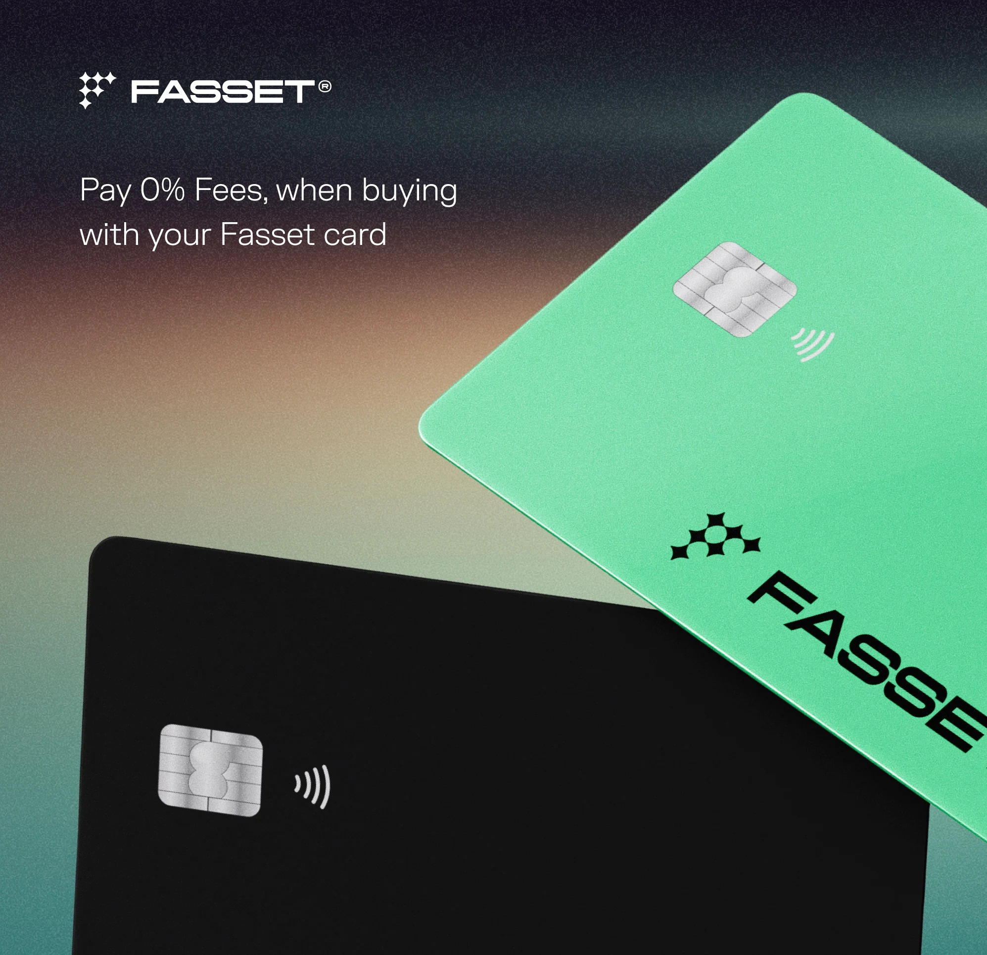
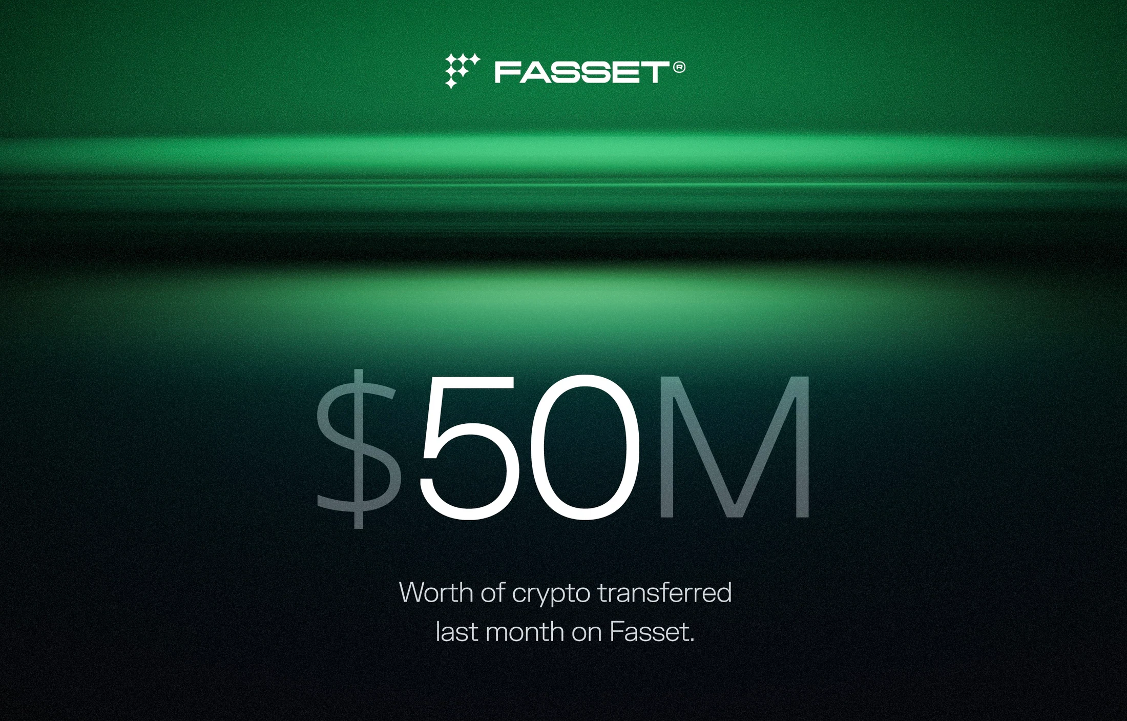
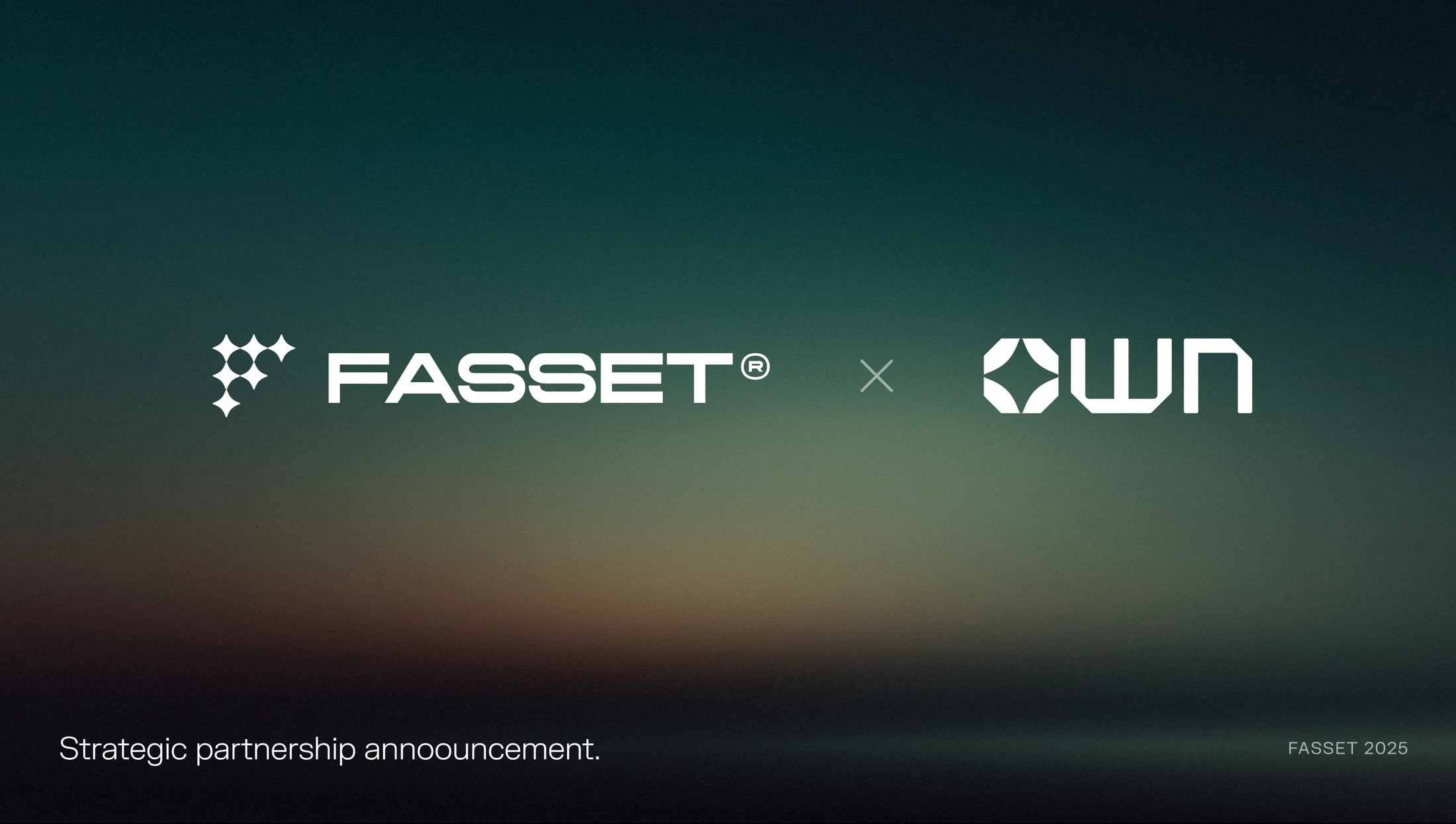
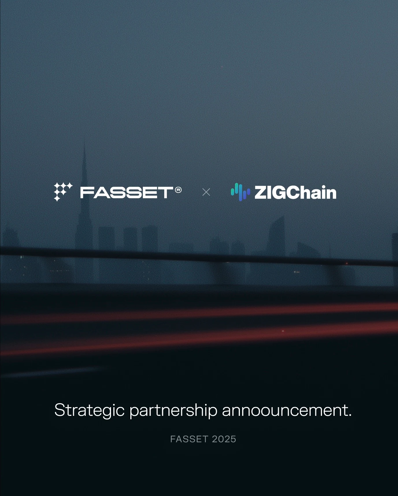
The selected work brings together brand guidelines, logo applications, primary and secondary palettes, typography hierarchy, photography direction, and blurred visual motifs. I extended that language into product-led campaign artwork, card promotions, launch communications, social assets, and partnership announcements.
What Changed
The work establishes a cohesive visual system across Fasset’s identity and marketing. Shared type, color, imagery, and layout principles give different messages a recognizable connection and provide a repeatable foundation for future communications.
Key deliverables
- Brand identity system
- Brand guidelines
- Color and typography systems
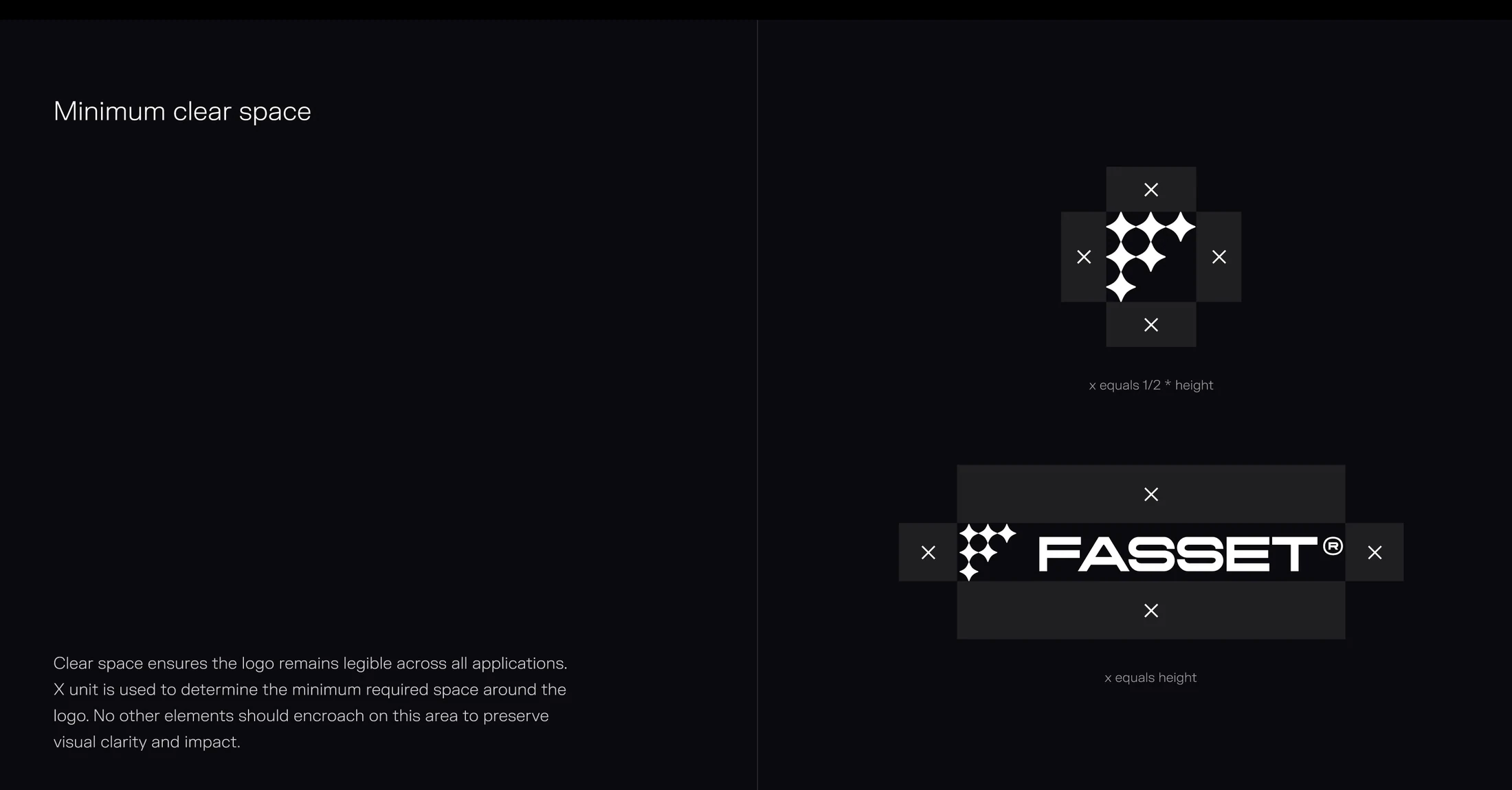
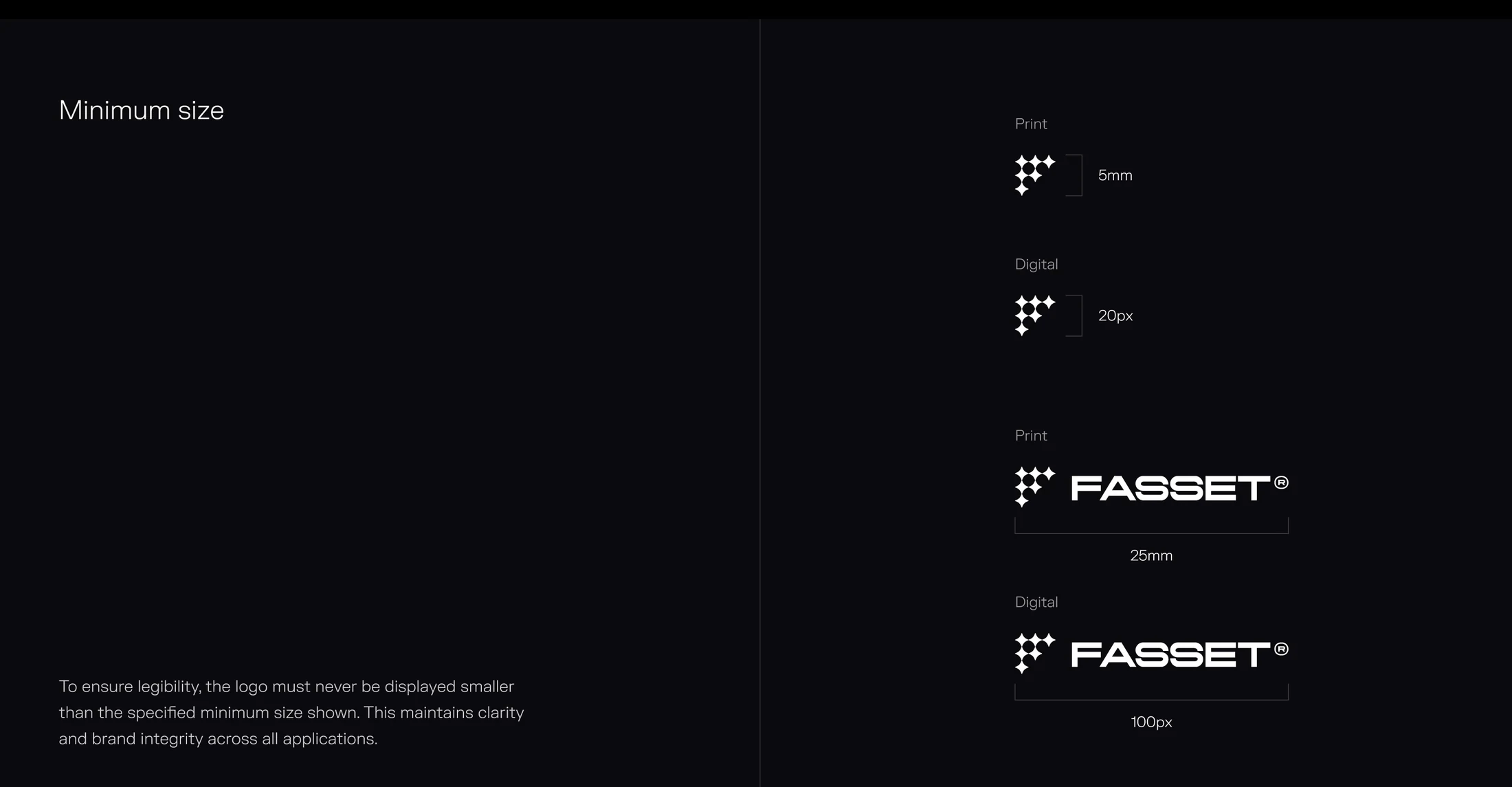
- Logo usage standards
- Photography and gradient direction
- Product-led campaign artwork
- Card and launch campaigns
- Social and partnership assets