Be!
Problem
Be! needed to bring its brand promise and everyday banking tools into one coherent experience. The challenge was to make accounts, cards, payments, spending insights, and security feel approachable without losing the clarity people need when managing their money.
My Decision
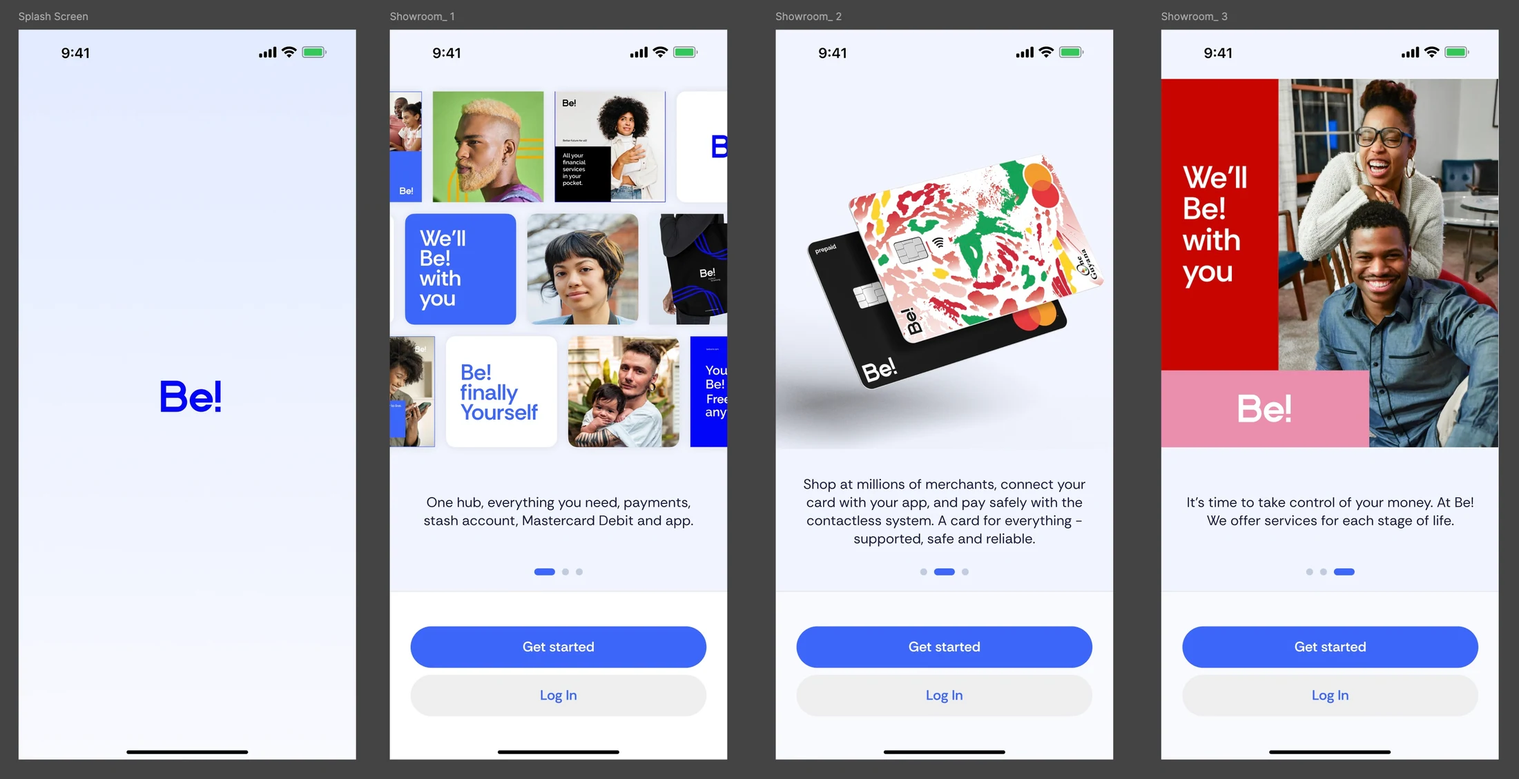
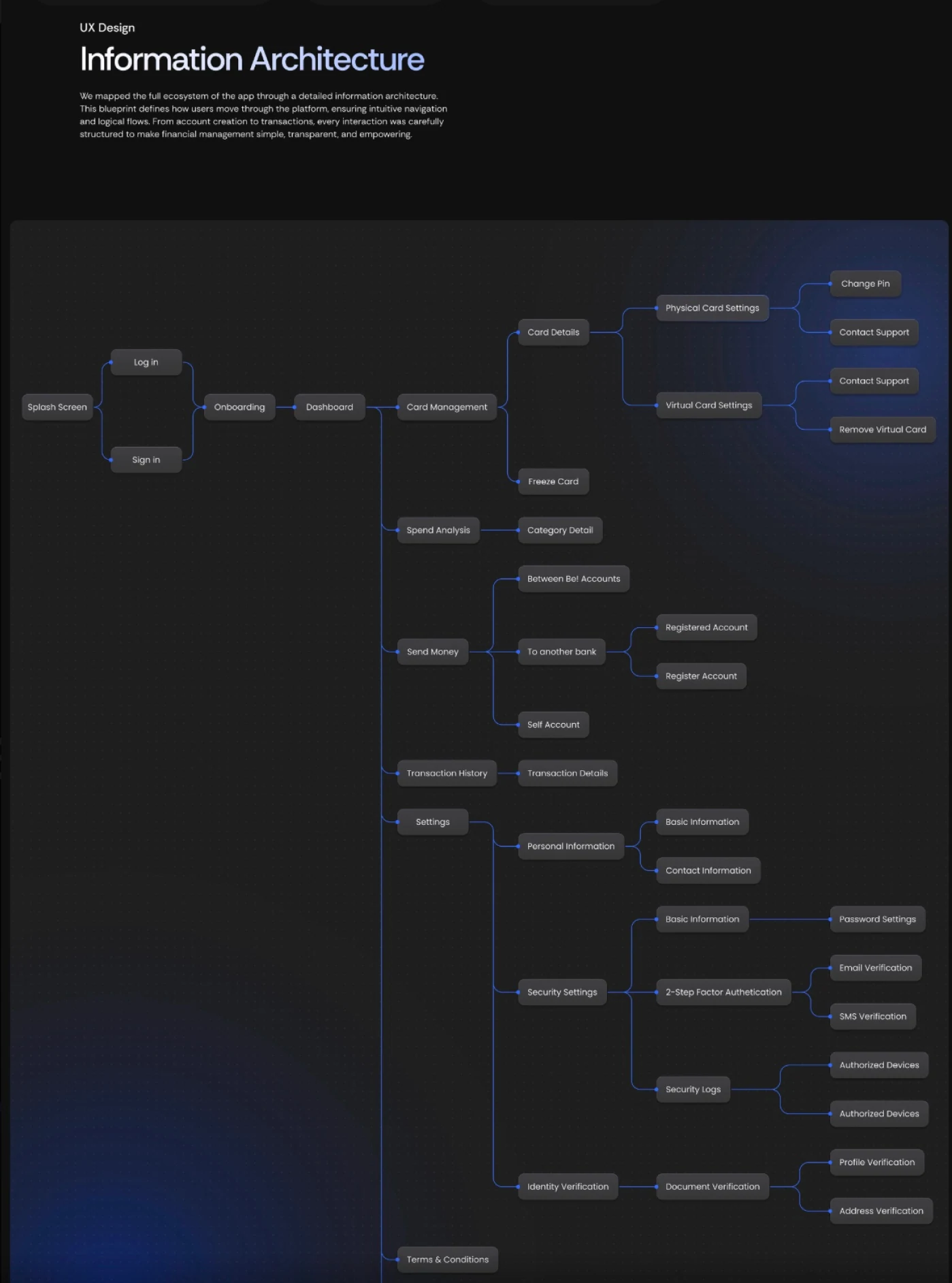
I connected an expressive, people-centered brand with a clear, practical product system. Bold blue, vibrant imagery, and direct messaging gave Be! its personality, while a structured information architecture organized the experience around everyday tasks: getting started, managing cards, sending money, and understanding spending.
What I Built
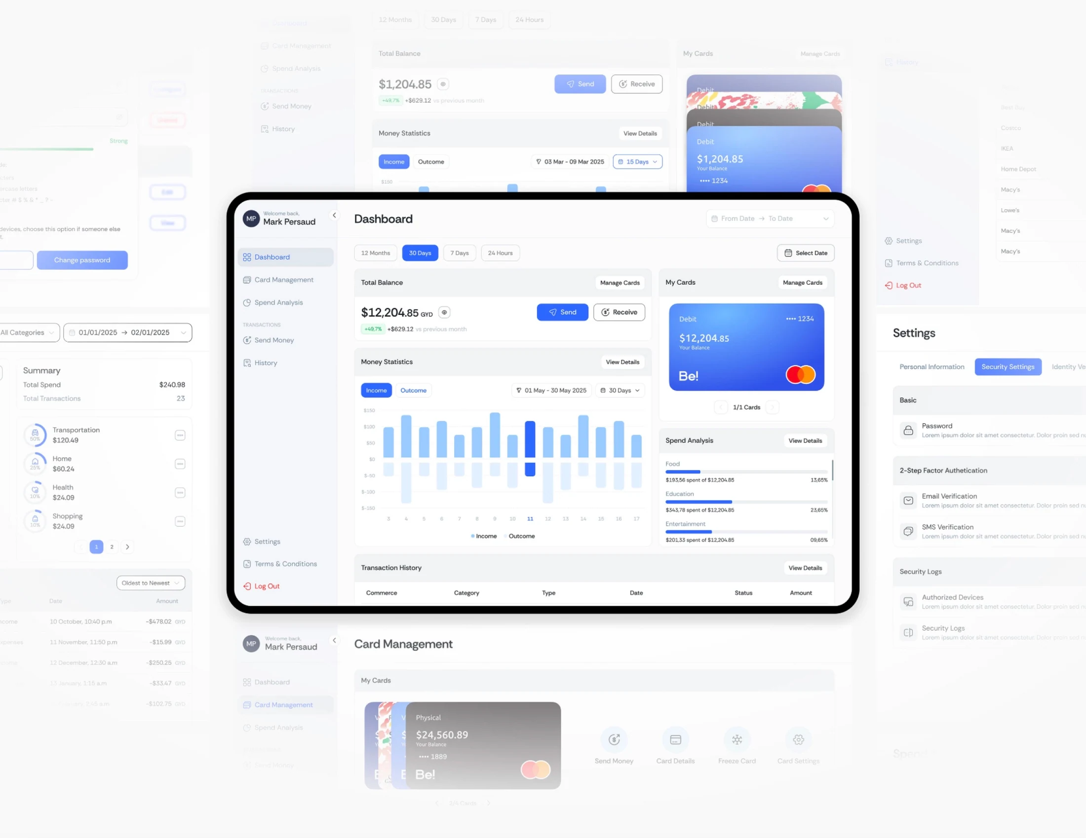
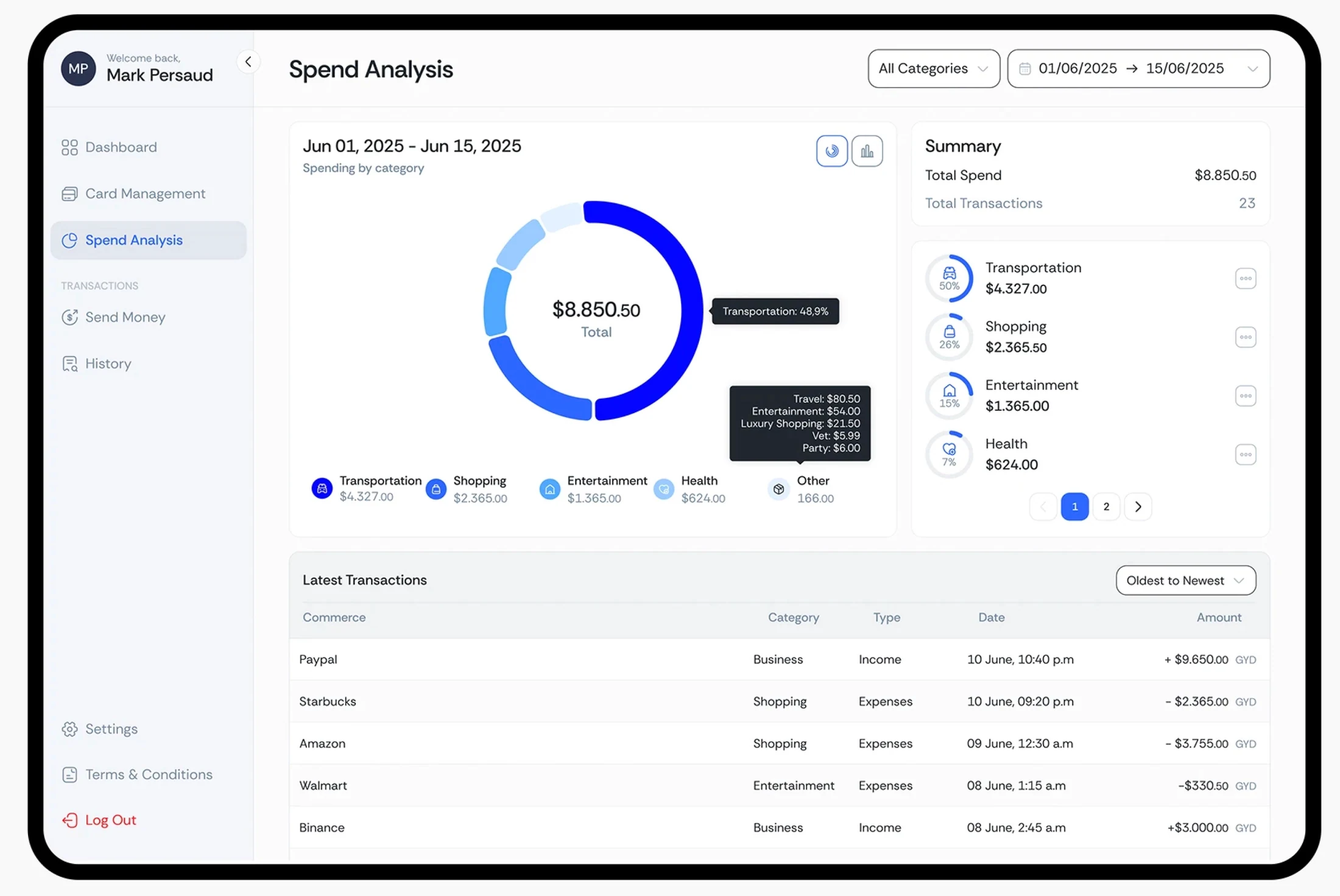
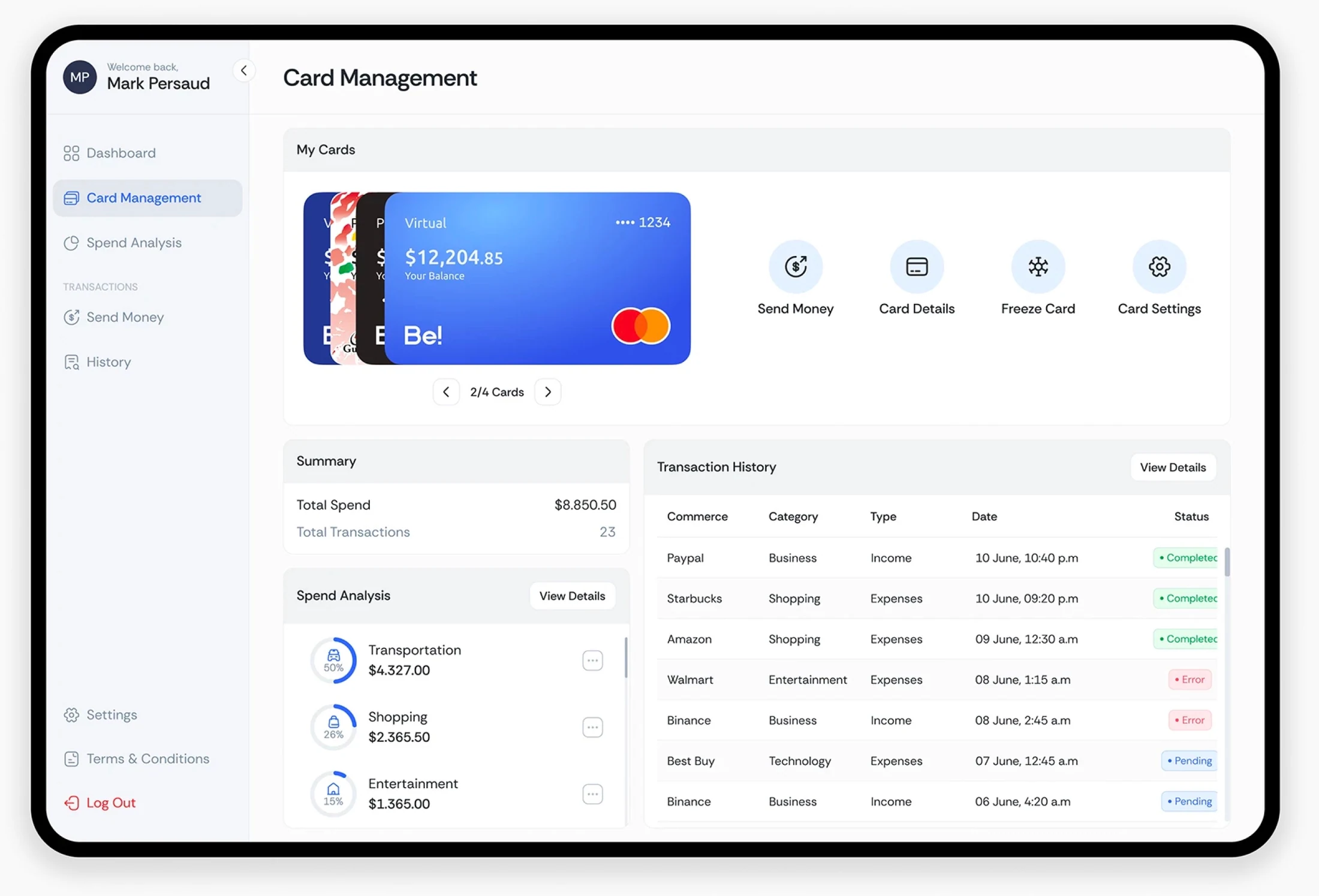
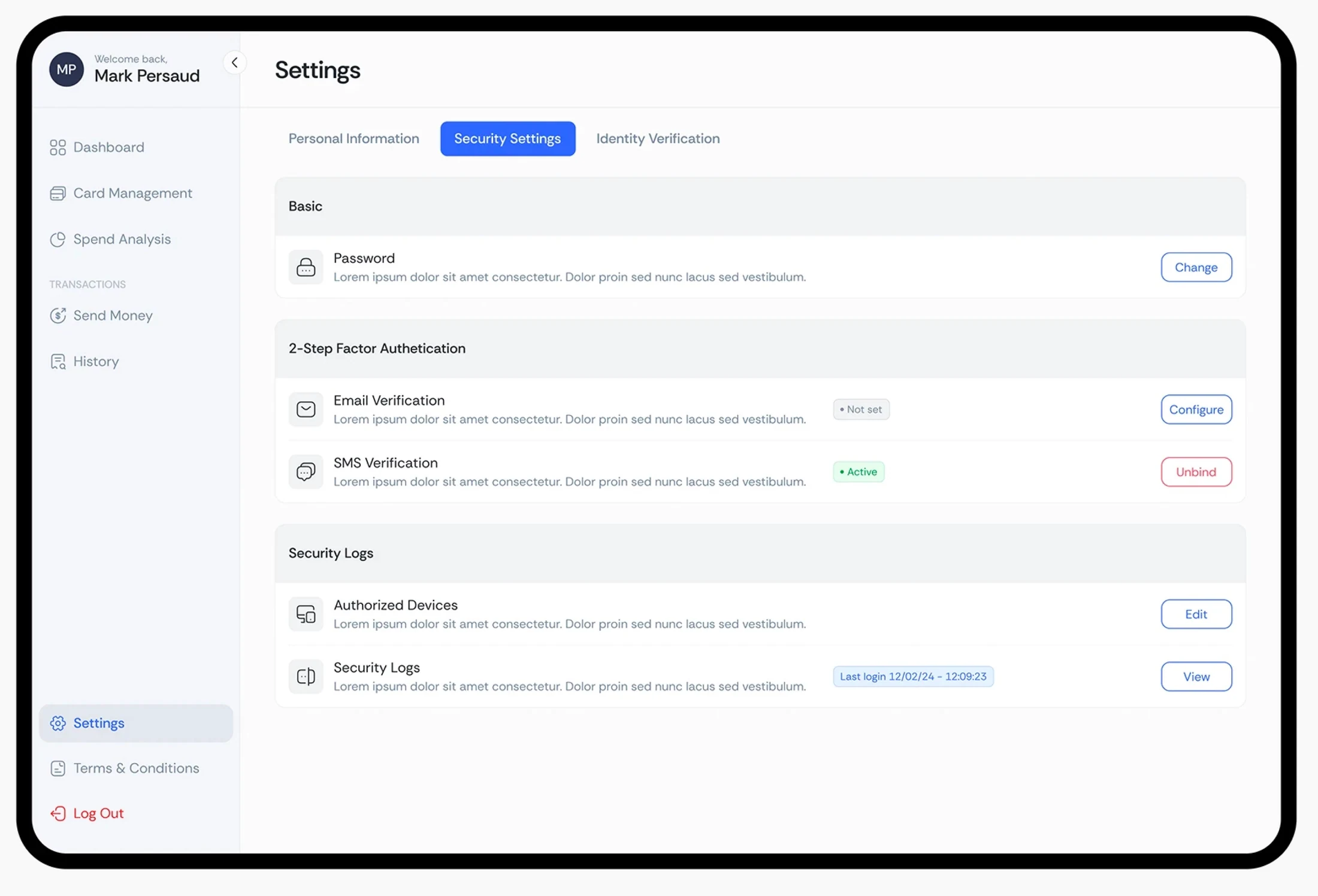
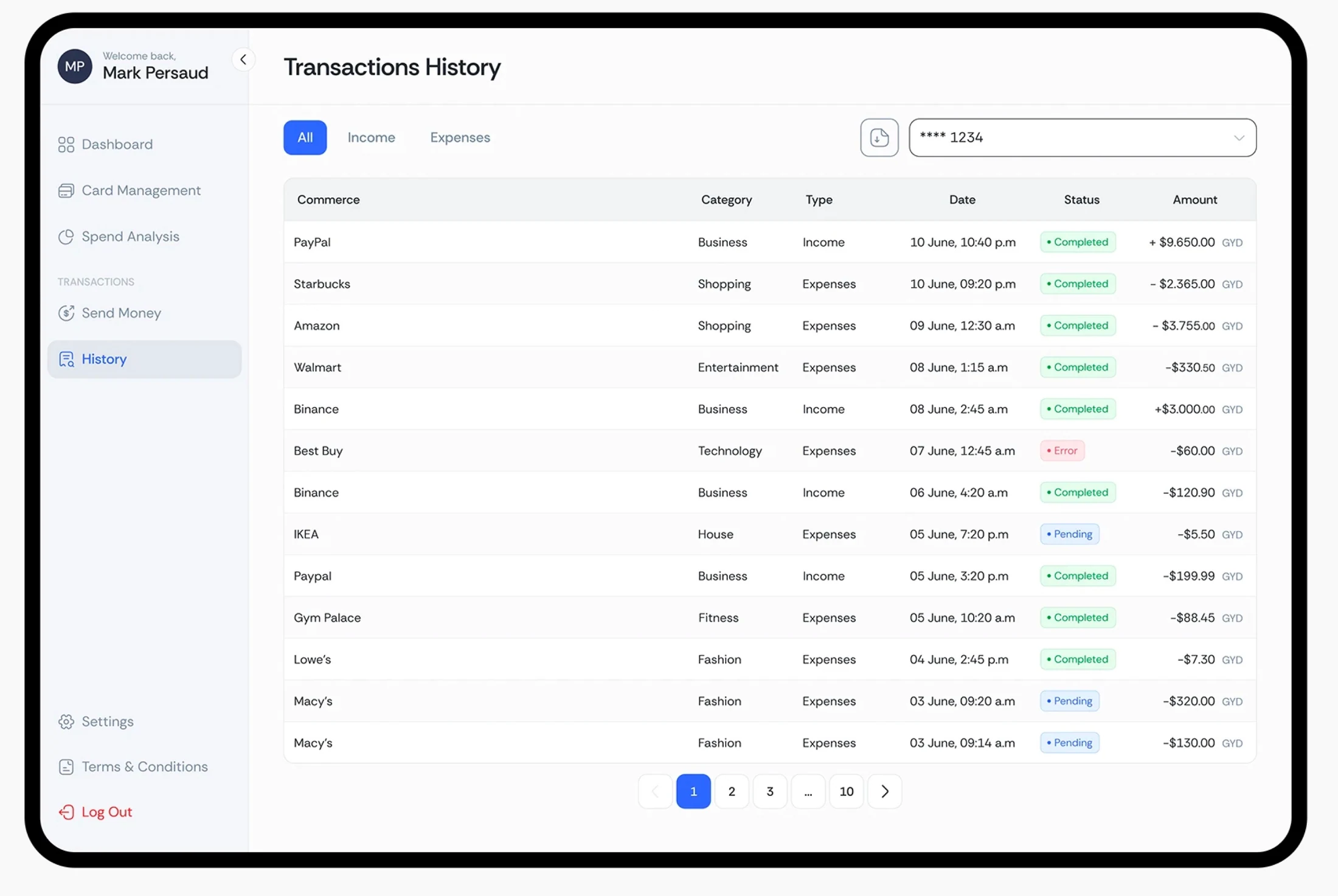
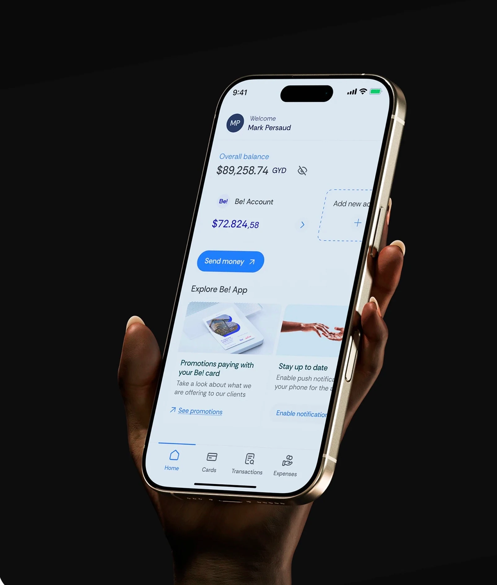
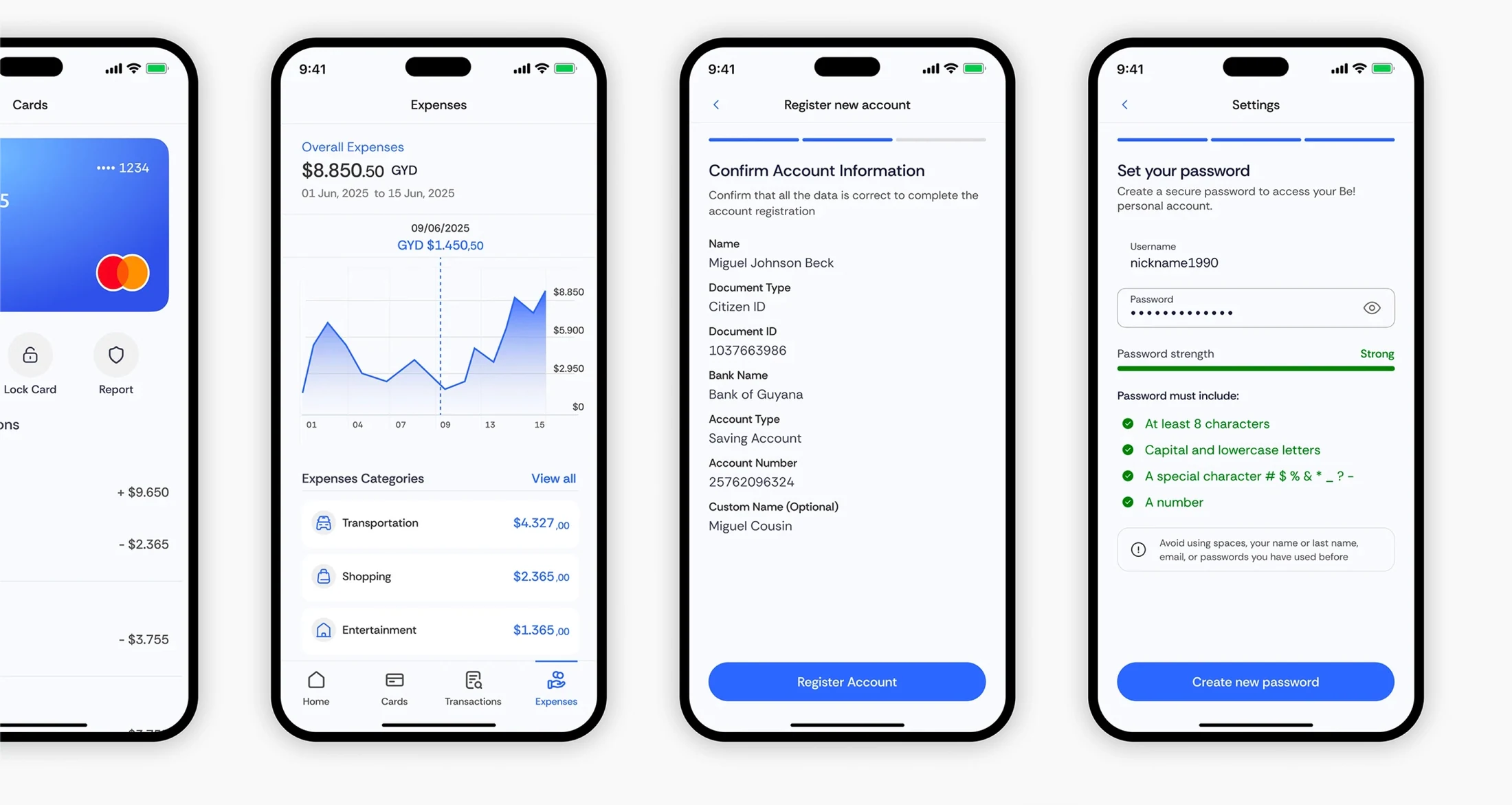
I designed across branding, web, and product, connecting the visual identity with the digital experience. The work included brand applications, web design, mobile onboarding, desktop dashboards, card management, spending analysis, transaction history, and account and security flows. Consistent navigation, interface patterns, and financial summaries carried the same design language across desktop and mobile.
What Changed
The work established a cohesive design foundation across brand, web, and product. An expressive identity gave Be! a recognizable voice, while the interface system brought its core financial tools together with consistent hierarchy and navigation.
Key deliverables
- Brand identity & visual direction
- Brand applications
- Web design
- Information architecture
- Desktop & mobile UX/UI
- Onboarding & account flows
- Card management
- Spending & transaction dashboards
- Security settings